Table of Contents
Screen Editing and Configuration
The default preset GUI for myCNC profiles is described in the following manual: MyCNC Profile Screen Description
In this manual, we will be going through all the different elements that can be used to display (and interact with) the necessary information on the myCNC screen. Sample examples for the step-by-step screen configuration of myCNC software are available here.
Video tutorial for screen editing:
Getting Started with editing the myCNC screen
By default, myCNC comes with a number of profiles, each with slight visual differences which are designed to best suit the workflow of a particular system, be it a plasma cutting machine, a mill, or a tangential knife setup. However, sometimes it is necessary to edit the software screen to better suit the particular workflow of the operator. Luckily, the myCNC software is almost endlessly customizable since it comes with the ability to edit the .xml files which are responsible for displaying the on-screen content.
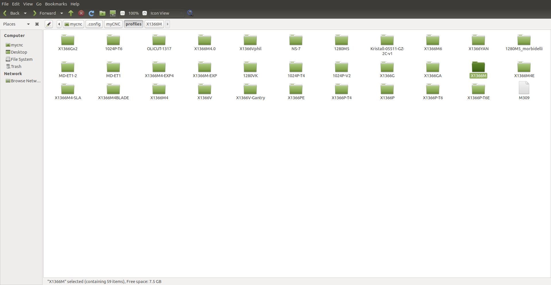
These .xml files are stored in your profile folder. On Ubuntu systems, go to your home folder, and then navigate to .config/myCNC/profiles. All your profiles (which can be chosen from within the myCNC software by going into Settings > Info) are stored here:
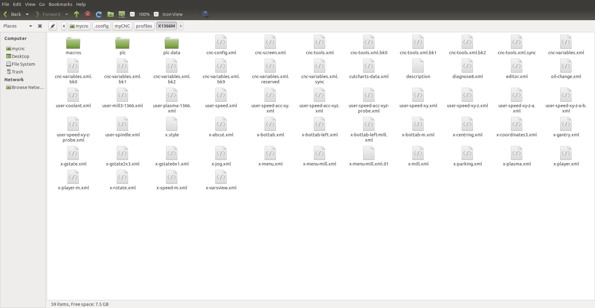
Upon opening the necessary profile folder (we will be using X1366M in this example, for the simple 3-axis mill profile), you are presented with a list of all the .xml files which will populate your screen:
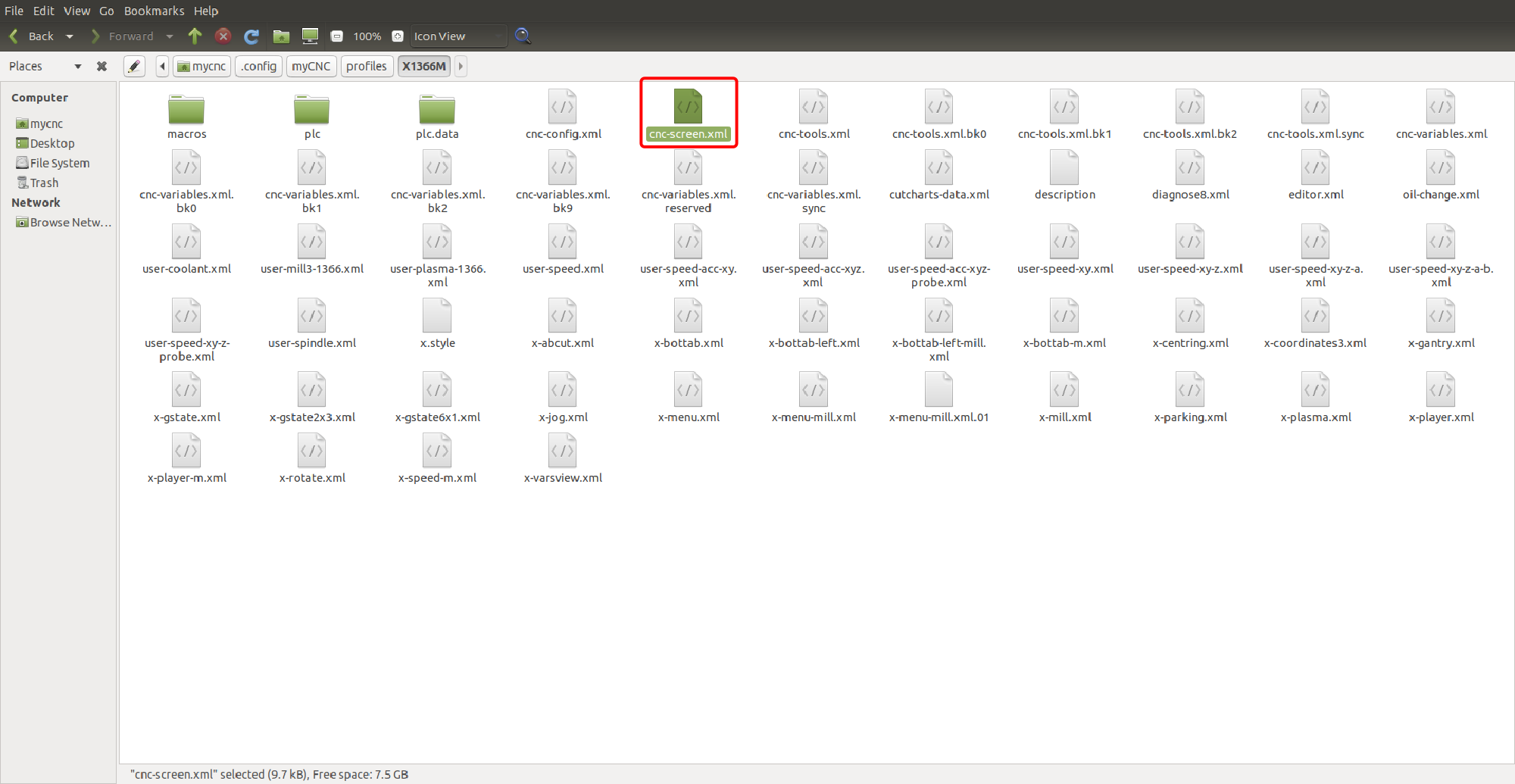
However, merely being in the profile folder does not mean that the .xml file's contents will be displayed on the myCNC screen. In order for the .xml file to be used, it must be included in the cnc-screen.xml file that is located within that profile's folder:
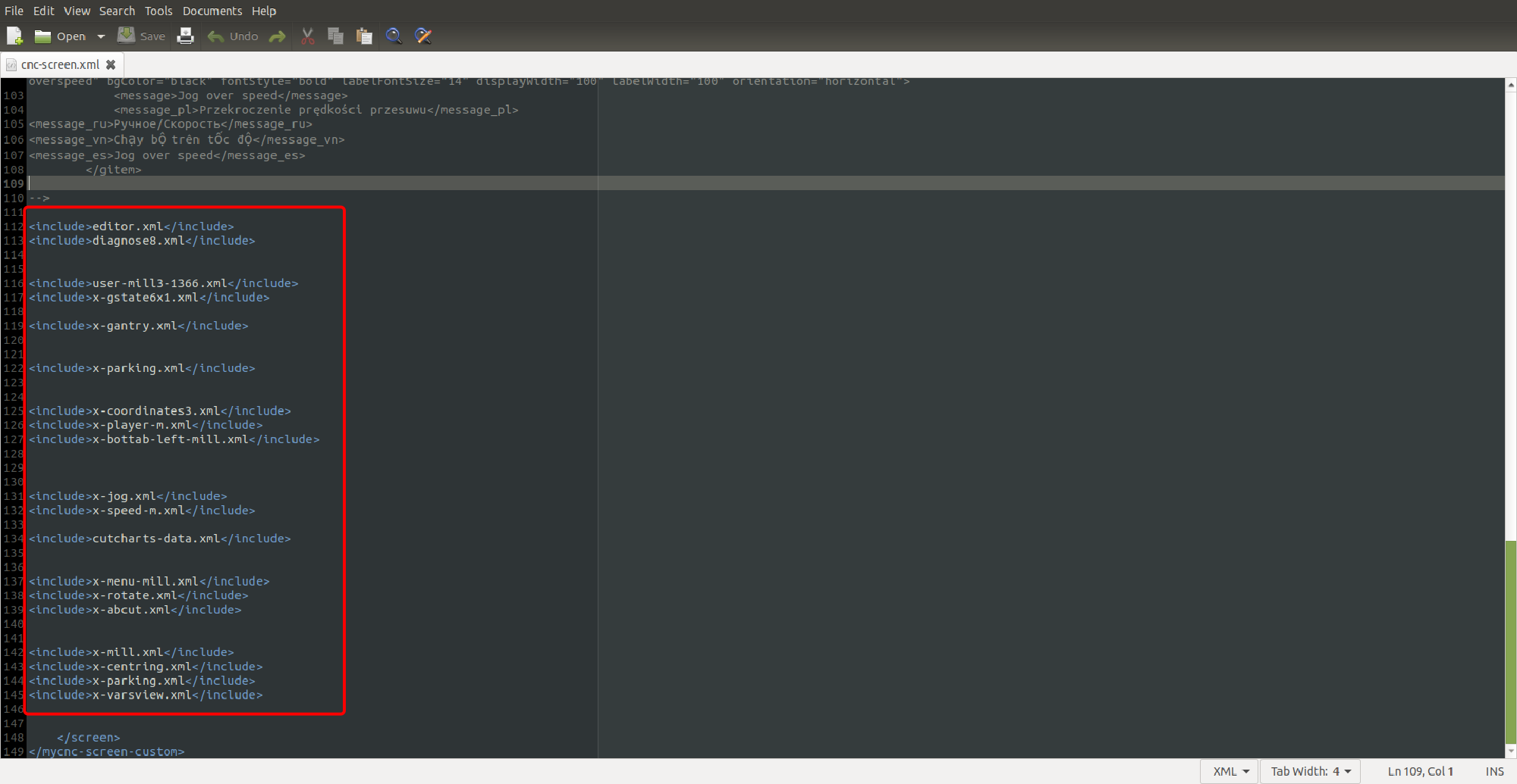
Upon opening the cnc-screen.xml file and scrolling down to the bottom, you are presented with a list of all the files from within the same folder which will be included when building the myCNC screen:
These files are named according to the different elements they put up on the screen (x-coordinates.xml is responsible for displaying the coordinates, x-gantry.xml deals with the gantry alignment widget, etc). Don't forget to save the files and reload the myCNC application for the changes to take effect.
In general, the order the files are loaded into myCNC (including .xml configuration files and your settings) is explained here:
MyCNC GUI elements
Below is a list of the main elements that can be utilized to create or edit a myCNC profile screen. Some of the functions of these elements overlap (such as BDisplay and KDisplay) - it is left to the user to decide which element best suits their workflow.
| Element | Use |
|---|---|
| Label | Unchanging text element |
| Display | Changing value |
| BDisplay | Changing value - can be clicked by the user to enter a new value |
| KDisplay | Changing value - can be clicked by the user to enter a new value |
| RadioDisplay | Changing value - preset from a list of choices |
| Radio2Display | Changing value - preset from a list of choices (update of RadioDisplay) |
| KSpinBox | Changing value - changed by pressing the arrows to increase/decrease |
| KSpinBox2 | Changing value - changed by pressing the arrows to increase/decrease, can be clicked to enter new value |
| LED | LED display to show some status (can be on/off) |
| SVG Display | Set of images to change depending on input |
| MyItems | Container element which can contain other elements |
| Border | Frame element which can contain other elements |
| Button | Button |
| XButton | Button with an LED indicator |
| GLView | 3D Visualization |
| NCView | 2D Visualization |
| Logview | Program log window |
| Statusbar | Progress and status bar |
| NCList | Program G-code commands list |
| Myscope | Time graphs |
| CentringView | Centering widget (built-in) |
| Rotation2View | Full program rotation widget (built-in) |
| timeview | Time (clock) display |
| time-display | View a global variable (such as #6120) in a 00:00:00 format |
| splitview | An element with two horizontal sections where each section will automatically fill all available space when the other is closed |
The following table outlines the parameters that define the on-screen elements within myCNC:
| Parameter | Example | Use |
|---|---|---|
| type | type=“label” | Element type |
| skin | skin=“gantry/gantry” | Background for the element |
| where | where=“oil-change” | Which container element is the current element in |
| position | position=“0;0” | XY position (in pixels) within the container element |
| width | width=“490” | Width, in pixels |
| height | height=“200” | Height, in pixels |
| labelWidth | labelWidth=“490” | Label width, in pixels (if the element is, or contains, a label |
| displayWidth | displayWidth=“90” | Width of the display element, in pixels |
| labelFgColor | labelFgColor=“##f-title” | Foreground colour for the label |
| labelBgColor | labelBgColor=“##b-title” | Background colour for the label |
| labelFontSize | labelFontSize=“18” | Label font size |
| labelFontStyle | labelFontStyle=“normal” | Label font style (normal, bold, etc) |
| message | <message>Mileage/Oil Change</message> | Static text being displayed |
| name | name=“display-cnc-gvariable-6090” | Name of the variable or input being displayed |
| bgColor | bgColor=“##b-display” | Background colour of the element (other than label) |
| fgColor | fgColor=“##f-display” | Foreground colour of the element (other than label) |
| fontStyle | fontStyle=“bold” | Font style (normal, bold, etc) |
| format | format=“%6.3f” | Format of presentation for a value (number of digits, number of decimal places, float/integer), or format of the list for a RadioDisplay type element |
| displayAlignment | displayAlignment=“right;bottom” | Alignment of the element (right, left, center, bottom, etc) |
| fontFamily | fontFamily=“Open Sans” | Font used for the element |
| deviation | deviation=“0.0005” | Minimum necessary change in the value to display a new value for the user |
| action | action=“direct-run:G90 G92 X %v” | Action that will be executed after the element has been clicked |
| orientation | orientation=“horizontal” | Orientation of the element (vertical/horizontal) |
| train-list | train-list=“laser-ramp” | A list of widgets/windows that will automatically close (be hidden) when this window is closed |
| cnc-password-widget | action=“cnc-password-widget-77/123579/%v” | A locked widget that requires the user to enter a password to open it |
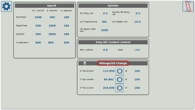
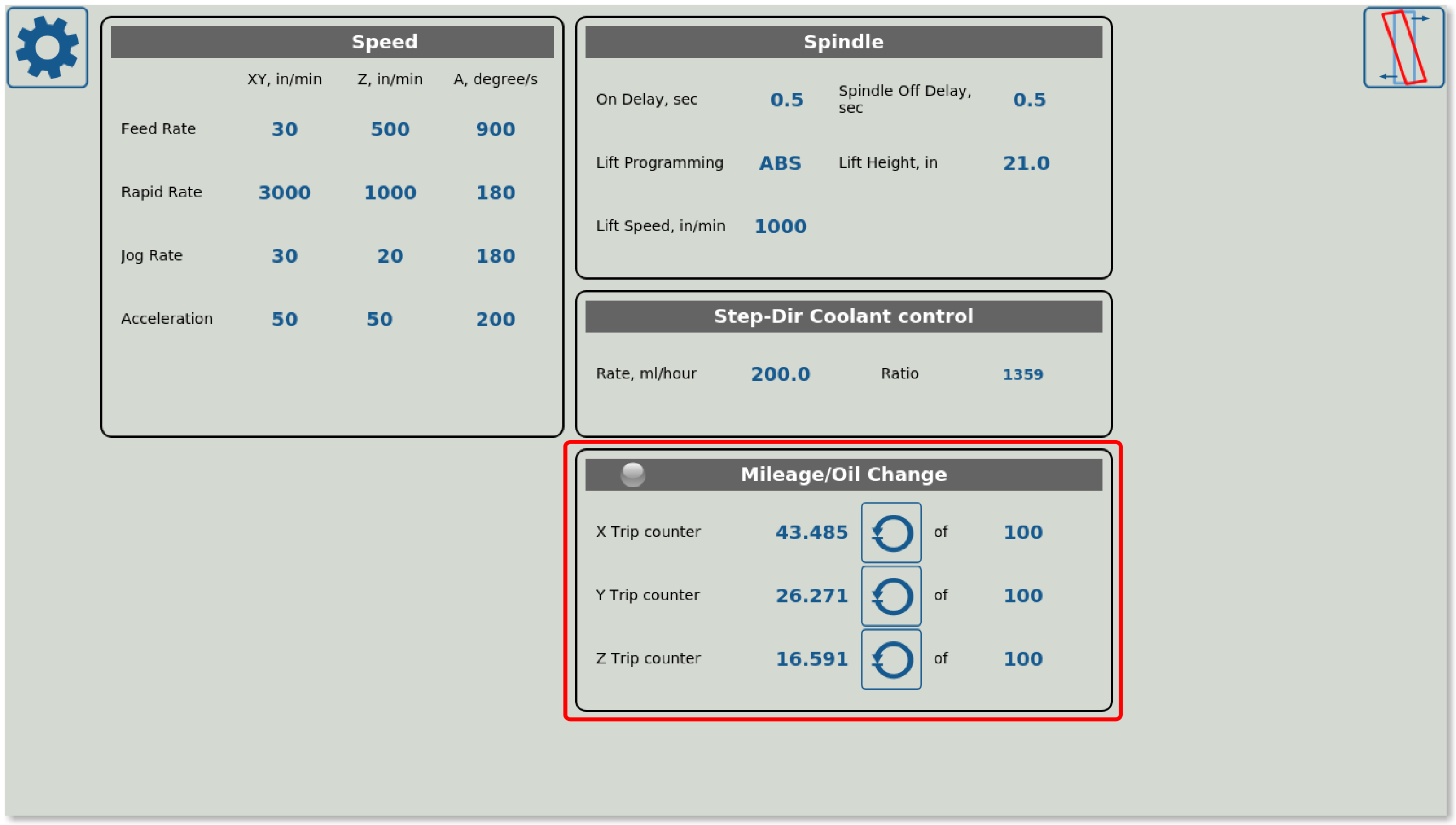
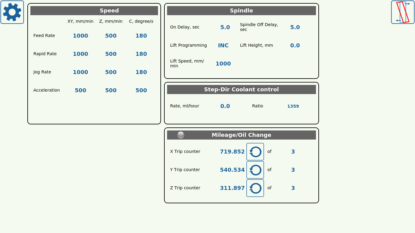
Labels are static text elements which are displayed as a text box (typically simple text headings/titles/etc). An example of such a label can be seen in the User Settings window of the 1366M4 profile, in the Oil Change tab:
Here, the Mileage/Oil Change title is a Label. The code for this label would be the following:
<gitem where="oil-change"
 position="0;0" width="490" height="30" labelWidth="490"
 type="label" labelFgColor="##f-title"
 labelBgColor="##b-title" labelFontSize="18" labelFontStyle="bold"  >
 <message>Mileage/Oil Change</message>
 <message_ru>Счетчик смены масла</message_ru>
</gitem>
- where describes the tab that this label element will be inserted into (in this example, it's the oil-change tab)
- position specifies the xy pixel position for the label. This position is specified not within the overall screen, but within the where tab (in this example, the position is specified in reference to the oil-change section).
- width and height are specified in pixels. Since the entire text box will be taken up by the label, the labelWidth is equal to the overall width.
- type assigns a category to the element that this code will display on the page. In this case, it is set to “label”
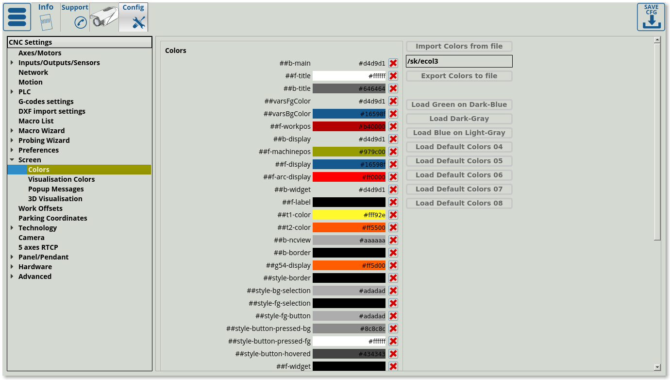
- labelFgColor specifies the foreground colour of the label. The colour can be typed in directly, in the HTML RGB format, or, as in this case, with the two pound signs in front (##f-title). This specifies to the program to retrieve this colour from Screen > Colors, or, if it is not there, it will be added to the list and can be later chosen from the Screen > Colors tab. Changes will take effect on the next reload (not instant). The following window shows an example of such a Screen > Colors list:
- labelFontSize specifies the font size, labelFontType is set to bold in this case. labelFontFamily can also be specified if a particular font is required (an example of using a labelFontFamily is available in the BDisplay section on this page). If it is not specified, the default font will be used.
- message can be written in the required languages (which must be specified). The program will automatically display the correct message for each selected program language.
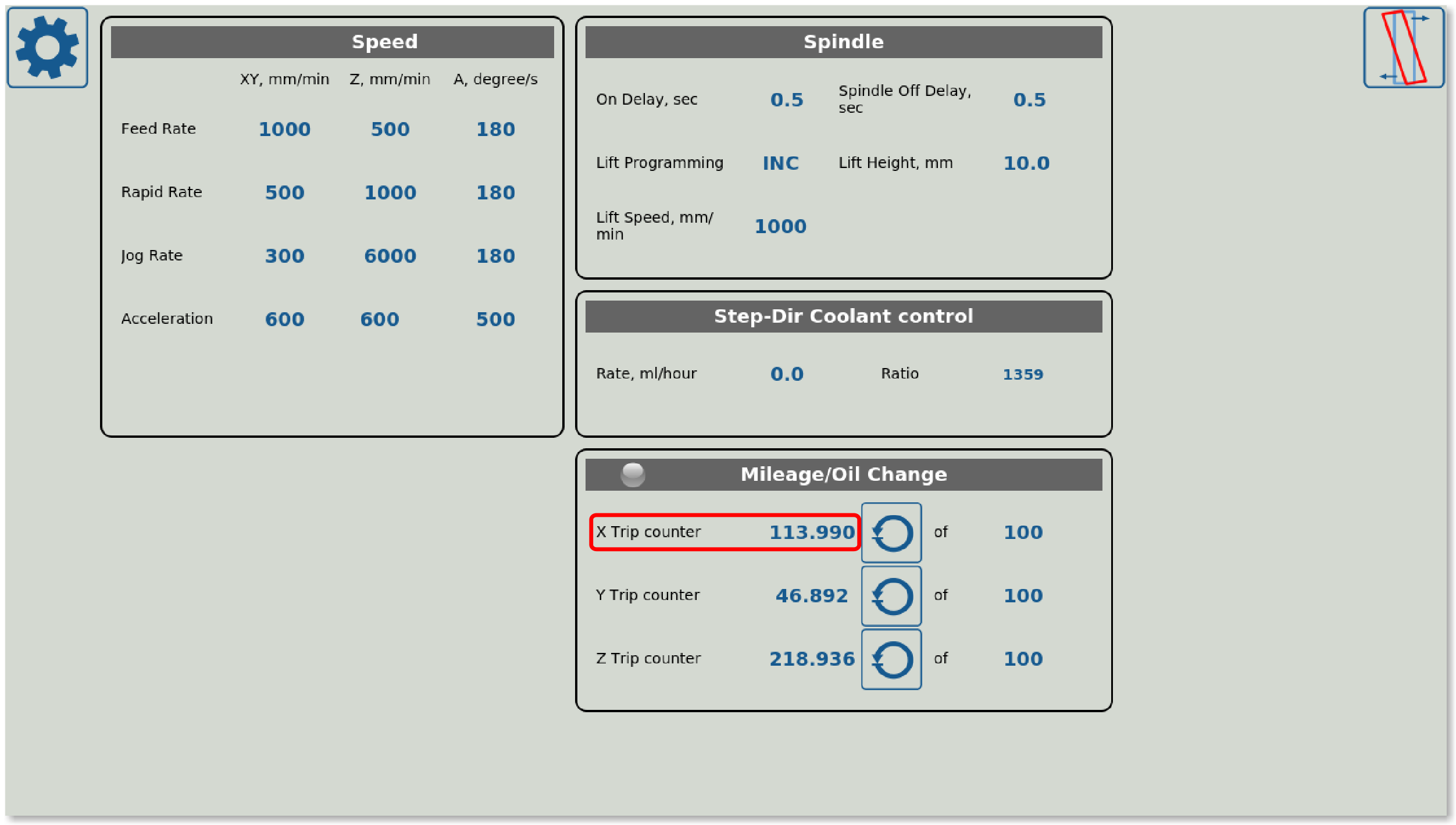
Display allows to show dynamic info (such as a changing value), and often works in conjunction with a Label (a label will create some title, and the dynamic changing value will be placed on the screen next to the Label as a Display). An example of a Display is the Trip Counter from the User Settings window in the 1336M4 profile:
The code for this element will look like this:
<gitem where="oil-change" position="10;40" width="250" displayWidth="90" height="60" labelWidth="160"
 name="display-cnc-gvariable-6090" K="0.001"
 bgColor="##b-display" fgColor="##f-display"
 labelFgColor="##f-label" labelFontSize="14" labelFontStyle="normal"
 fontSize="18" fontStyle="bold" format="%6.3f" type="display" >
            <message>X Trip counter</message>
<message_ru>Счетчик пути по Х</message_ru>
</gitem>
- where descibes the section into which the Display element will be inserted.
- position describes the xy position within that tab
- width and height specify the overall dimensions of the Display element, while displayWidth and labelWidth describe the size of the Display and Label parts (Display being the dynamic changing part and Label being the static text part).
- name specifies the variable name for the displayed element (global variable #6090 is brought up on the screen in this case)
- bgColor and fgColor specify the background and foreground colours of the Display element (or any other element, depending on where they are specified) respectively. As with a Label, these colours can either be set directly, through an HTML RGB code, or by writing out the colour name from Screen > Colors prefaced by two pound signs (##). If no specified colour with that name is found in that list, then the new name will be added to the list and the user will be able to edit it (changes will take effect on the next program reload).
- Similarly, labelFGColor specifies the foreground color of the Label (static text) element (this is set separately from the Display element colour).
- format specifies how the values are presented. The first number specifies the overall digits that the value will display, while the second number specifies the amount of digits after the dot. F stands for float, while d stands for integer. For example, in this case, %6.3f specifies a float number with six total digits maximum and which allows the number to display up to the third decimal place (degree of accuracy).
- deviation can be specified to indicate the minimum absolute value change that would require the program to display a new value. For example, deviation of 0.01 means that the value needs to change by at lease 0.01 (absolute value) for the new numeric value to be displayed. This allows to eliminate visual changes/jumps in numbers due to small changes which can be disregarded.
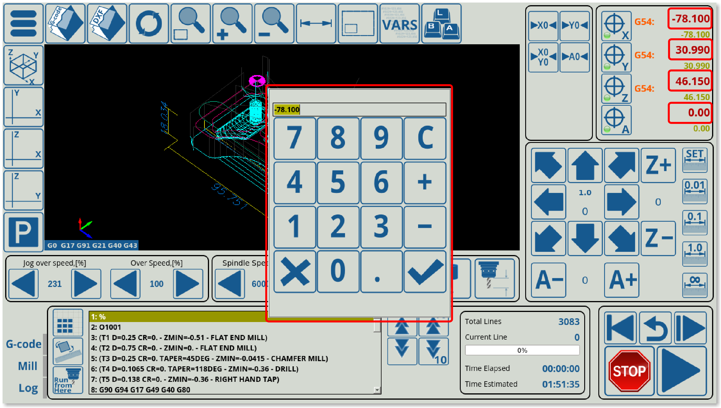
The BDisplay element allows to display a dynamic value, like a typical Display, which can also be clicked. When clicked, a popup element will be brought up on the screen that will allow the user to enter a new value. For example, the program coordinates displayed on the main screen of the software are BDisplay elements which bring up a popup when clicked, allowing to change their values:
An example of BDisplay code would be the following:
<gitem where="x-coordinates" position="74;10"
  width="150" height="34"  displayAlignment="right;bottom"
  fgColor="##f-workpos" format="%8.3f" fontFamily="Open Sans" fontSize="21"
  type="bdisplay" deviation="0.0005" action="direct-run:G90 G92 X %v"
  name="display-work-pos-axis-0" bgColor="##b-display"
  displayWidth="150" fontStyle="bold"></gitem>
- fgColor and bgColor specify the colours used for the foreground and the background of the BDisplay element respectively.
- displayAlignment allows to position the displayed element in the right bottom corner of the specified area
- format works in the same way as the Display format
- type is specified to be “bdisplay”
- deviation specifies the minimum change in the value to display a new value for the user. This is done in order to prevent excessive value jumping due to small changes.
- action allows to perform some sort of action or command after the confirmation checkmark in the popup window is pressed (after the new value is entered). This value is stored as %v and will be used to change the program coordinates to the necessary value in the selected axis. This is extremely useful for changing the values which would require an action to do so (e.g. some kind of machine movement). If no actions are required (i.e., if all that is required is a value/variable change which does not lead to direct machine actions immediately), KDisplay can also be used.
- name specifies the global variable or the item that the element will be receiving its value from to display. In this case, it is receiving a value from the work-pos-axis-0 item. A comprehensive Common Item list and Global Variables list can be used for reference in choosing a name for a BDisplay element.
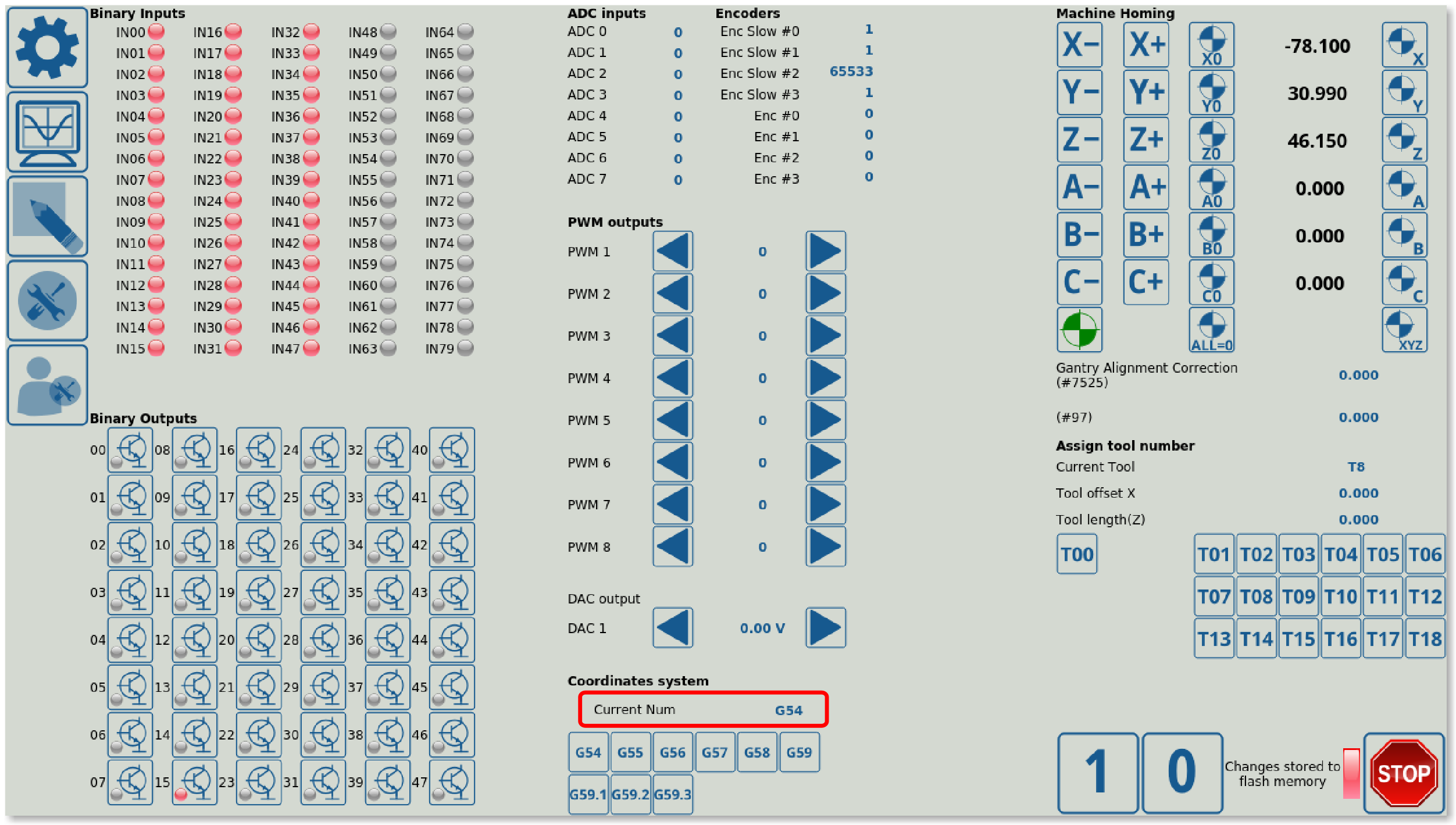
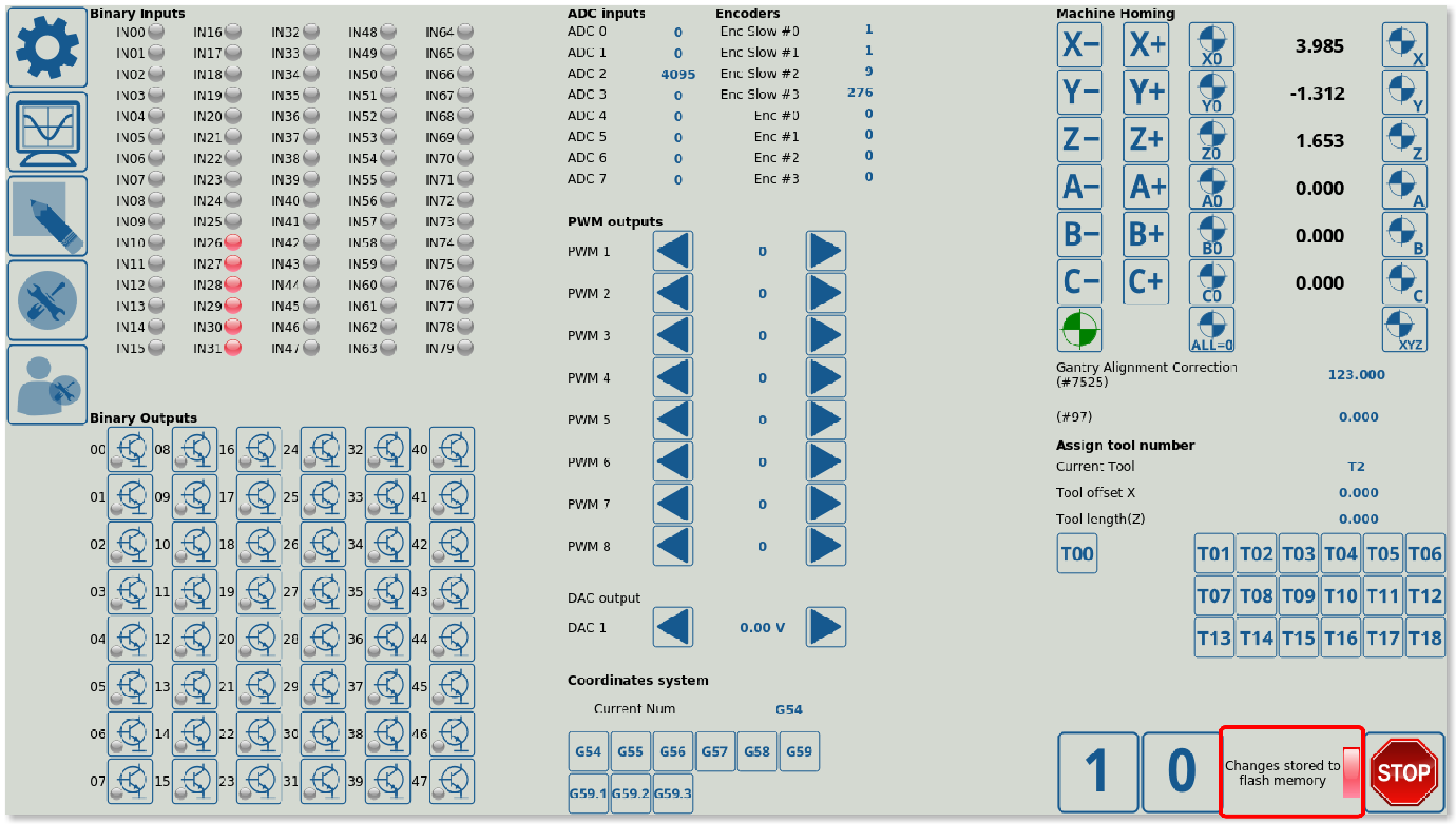
RadioDisplay allows to display some value from a list. For example, the display of the coordinate system in the Diagnostics window of the 1366M4 profile is done by using a RadioDisplay element. This allows the user to select some coordinate system (which is not labeled G54/G55/etc within the software, but rather 1, 2, 3, etc), and then display the selected choice as some sort of a user-facing text string (thus, for example, displaying a software “2”, which would not be useful to the user without an external reference sheet, as “G55”). This is useful to “translate” machine settings or error codes into a text string that the user can easily read:
An example of code for such a RadioDisplay element is presented here:
<gitem fgColor="##f-display" labelFgColor="##f-label" where="coord-sys0"
labelWidth="80" displayWidth="160" format="---;G54;G55;G56;G57;G58;G59;G59.1;G59.2;G59.3"
height="40" type="radio-display" name="display-gvariable-5220"
bgColor="##b-display" fontStyle="bold" orientation="horizontal">

<message>Current Num</message>
<message_pl>Aktualny numer</message_pl>
<message_ru>Номер</message_ru>
<message_kr>Current Num</message_kr>
<message_vn>Số hiện tại</message_vn>
<message_es>Actual</message_es>
</gitem>
- Colours are selected the same was as described in the Display and Label sections (foreground/background, label colours, etc)
- format lists the list of all possible user-facing text strings. These are numbered 1, 2, 3, etc, separated by a semicolon.
- type is set to “radio-display”
- name is the system variable which will be used to choose the user-facing text string. The system will read, for example, Global Variable #5220, and see what value (for example, 4) is written in it. Then, if 4 is written in 5220, G57 will be displayed to the user.
- orientation can be set to be horizontal or vertical
NOTE: RadioDisplay and Radio2Display allow for some rudimentary actions to be assigned to the action of clicking the RadioDisplay element. These are limited compared to the Button/XButton/etc elements, however they are still extremely useful:
| Action | Description |
|---|---|
| cnc-gvariable-switch | Switches between different values for a global variable (these variables are preassigned and set as a list separated by commas) |
| cnc-gvariable-toggle | Toggles a global variable between 0 and 1 upon RadioDisplay/Radio2Display clicks |
| item-switch | Switches between preassigned values/entries for an item |
| toggle-item | Toggles an item from the Item list (toggle writes 0 or 1 to the item depending on the previous item state) |
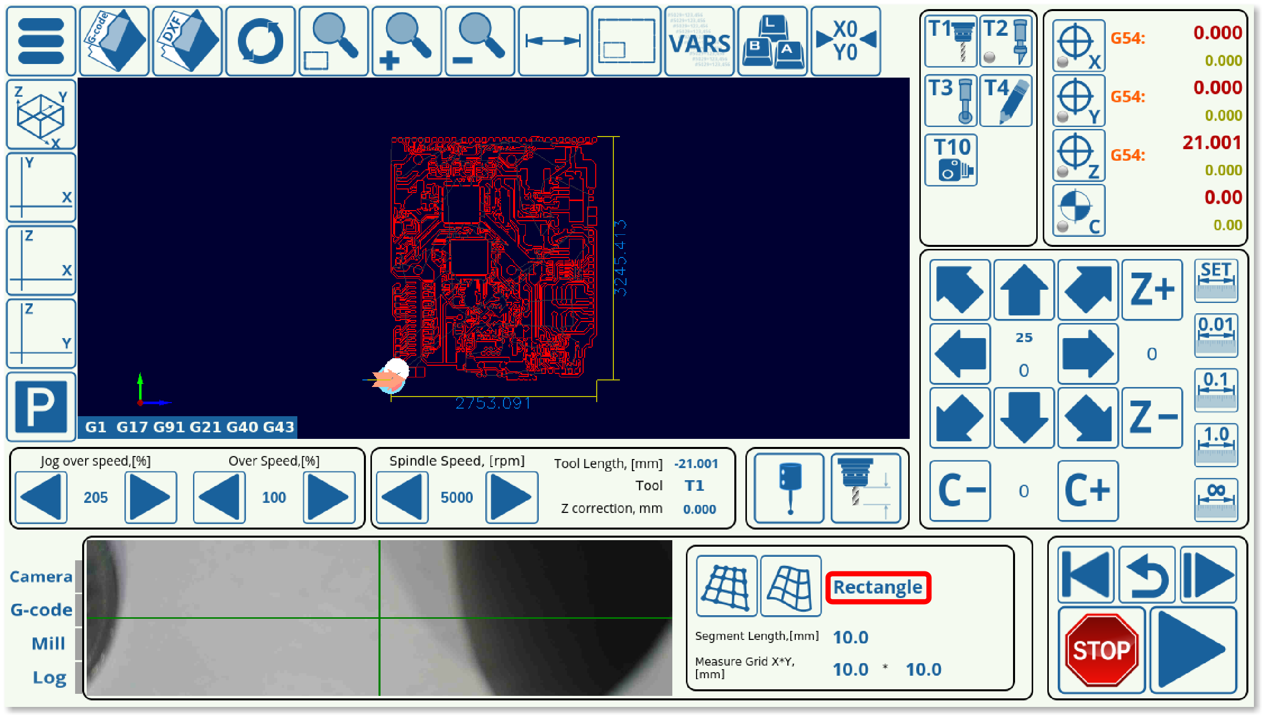
An example of actions being assigned to the RadioDisplay can be seen in the 1366V profile when creating a per-program z-height map to account for uneven material positioning. The RadioDisplay element switches between “Area” and “Rectangle” depending on the mode chosen to create the probe mesh:
If we look at the code, the RadioDisplay element is actually using the cnc-gvariable-toggle to change between the two modes (0 for Rectangle, 1 for Area):
<gitem where="map-z-view" position="150;5"
 displayWidth="110" width="110" height="70"  displayAlignment="_center"
 fgColor="##f-display"
 format="Rectangle;Area" fontFamily="Open Sans" fontSize="20"
 type="radio-display" deviation="0.5"
 action="cnc-gvariable-toggle-8255"
 name="display-cnc-gvariable-8255"
 bgColor="##b-display" fontStyle="bold">
</gitem>
- action is set to “cnc-gvariable-toggle-8225”. Here, when the RadioDisplay element is clicked, the action is triggered and the global variable is toggled between 0 and 1.
- format is set to “Rectangle;Area”. This corresponds to the 0/1 toggle for the global variable, when the RadioDisplay is clicked, the visual display element also switches - however, it is important to note that it is the action and not the format which determines what actually happens to the program when the click occurs.
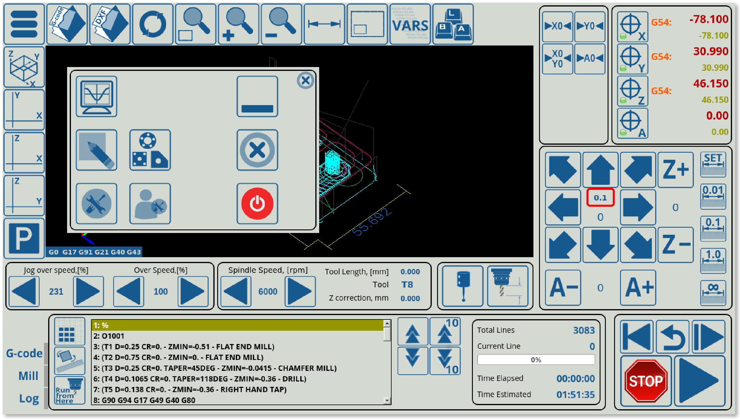
Radio2Display allows for a more granular display configuration than the simpler RadioDisplay. Similar to RadioDisplay, Radio2Display transforms some system values into a user-facing string from a list of options which are specified beforehand. For example, the step size values for the jog buttons on the main screen of the 1366M4 profile use Radio2Display elements:
Example code for this screen element:
<gitem where="x-jog" position="90;100" width="80" height="40" displayWidth="80"
 fgColor="##f-display" bgColor="transparent"
 alignment="center" fontSize="14" type="radio2-display"
 format="0.001=0.001;0.01=0.01;0.1=0.1;1.0=1.0;10=10;∞=88.88=2.3"
 deviation="0.0005" name="display-gvariable-5522"
 fontStyle="bold" orientation="vertical" ></gitem>
- bgColor (background colour) can be set to be transparent
- type is set to be radio2-display
- format lists all the available options. For example, when the input is equal to 0.1, the system will display 0.1. And when the input is equal to the jog step of 88.88, the system will recognize this command and set the jog to infinity (infinite step). If another number is added to each component, like in the ∞=88.88=2.3 line, that third number specifies the font size for that particular text element. Here, the infinity sign will be 2.3 times larger than the default of the same font, allowing for the infinity sign to be more clearly visible to the end user.
- deviation specifies the minimum value by which the parameter should change by for the change to be visually represented on the screen
- name indicates the global variable that the system is monitoring (global variable #5522 in this case)
Similar to RadioDisplay, Radio2Display allows for a limited number of actions which can be assigned to the action of pressing or clicking the Radio2Display element:
| Action | Description |
|---|---|
| cnc-gvariable-switch | Switches between different values for a global variable (these variables are preassigned and set as a list separated by commas) |
| cnc-gvariable-toggle | Toggles a global variable between 0 and 1 upon RadioDisplay/Radio2Display clicks |
| item-switch | Switches between preassigned values/entries for an item |
| toggle-item | Toggles an item from the Item list (toggle writes 0 or 1 to the item depending on the previous item state) |
The example in RadioDisplay code can also be used to assign actions to Radio2Display if type=“radio2-display”.
KDisplay is similar to BDisplay, as it allows to display some dynamic changing variable/number and to register when it is clicked on the software screen (after which the user can enter a new value). It is different from BDisplay in that it is geared towards keyboard/mouse combos (rather than touchscreen setups) and does not bring up a full popup screen, and because it does not allow for actions to be executed after the new value has been inputted. As such, it is typically used on simple value changes which do not cause direct machine actions immediately after.
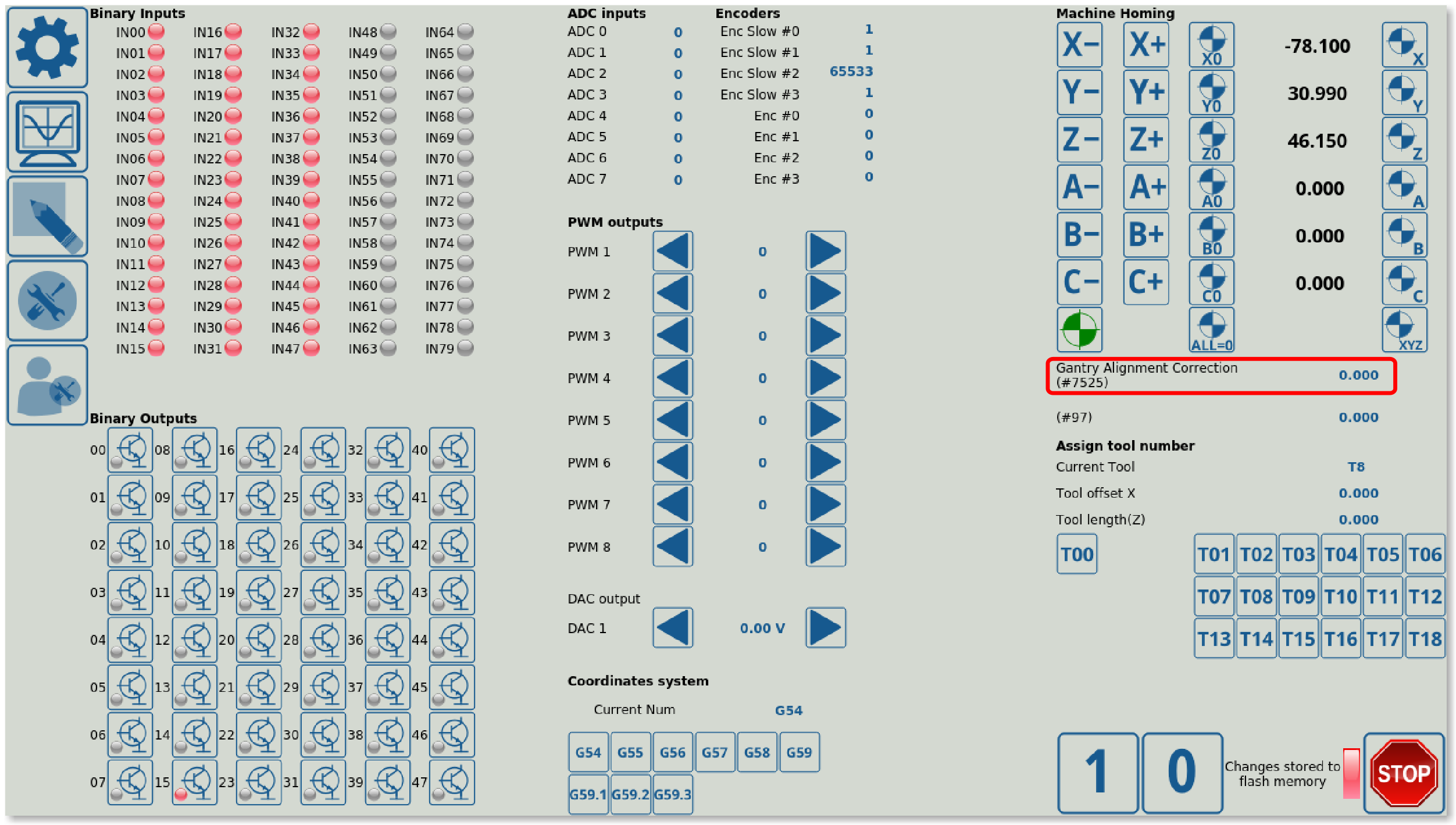
For example, the gantry alignment correction value can be changed from the Diagnostics window of myCNC software using a KDisplay element:
   <gitem fgColor="##f-display" labelFgColor="##f-label" where="gantry-correction" labelHeight="40"
   labelWidth="200" displayWidth="90" format="%6.3f" height="40"
   type="kdisplay" name="display-cnc-gvariable-7525" bgColor="##b-display"
   fontStyle="bold" orientation="horizontal" deviation="0.001" >
   <message>Gantry Alignment Correction (#7525)</message>
   <message_ru>Коррекция для выравнивания портала (#7525)</message_ru>
   <message_vn>cái dá căn chỉnh điều chỉnh(# 7525)</message_vn>
   <message_es>Corrección de alineamiento Gantry (#7525)</message_es>\
   </gitem>
- Colours are set similarly to the other elements (Display, BDisplay, etc), allowing to change the foreground/background and label colour of the displayed element.
- type is set to “kdisplay”
- name displays the global variable that will be used in this field (in this example, it's global variable #7525 for the gantry alignment procedure)
- deviation specifies the minimum value by which the parameter (global variable used in this case) should change for the change to be visually represented on the screen. This cutoff allows to disregard some small changes.
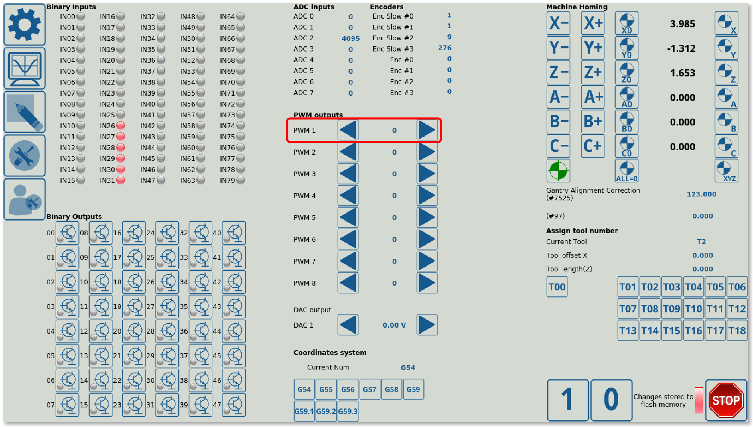
KSpinBox shows a certain value with an arrow on either side, allowing the user to change the value upon pressing (or pressing and holding) the arrow buttons. The PWM outputs section of the Diagnostics window is done using KSpinBoxes:
Example of KSpinBox code:
 <gitem fgColor="##f-display" labelFgColor="##f-label"
  where="pwms" format="%d" labelWidth="80" displayWidth="80" alignment="left"
  action="hw-pwm-dec;hw-pwm-inc" height="40" address="pwm-outputs" number="0"
  type="kspinbox" bgColor="##b-display" fontStyle="bold">
  <message>PWM 1</message>
  <message_pl>PWM 1</message_pl>
  <message_cn>PWM的1</message_cn>
  <message_ru>ШИМ1</message_ru>
  <message_kr>PWM 1</message_kr>
  <message_es>PWM 1</message_es>
  </gitem>
- colours are done in a similar manner to Labels, Display, BDisplay elements and others (foreground/background colours, label colours, etc).
- where specifies the location of the displayed element (the PWM section of the screen)
- alignment specifies the positioning of the displayed element
- action specifies the two action that are taken when the user presses on the left and on the right arrow respectively. Here, “hw-pwm-dec” and “hw-pwm-inc” are used to increase and decrease PWM outputs values. The full list of available actions is available on the page below, in the Actions section.
- address specifies the address of the value/item the user is changing (pwm-outputs in this case)
- number specifies the particular hardware port that the on-screen element will be monitoring. Here, it is the number of the PWM output, as specified in the address. It is counted from 0, not from 1, so PWM output 1's number is 0, PWM Output 2 is number 1, etc.
- type is set to “kspinbox”
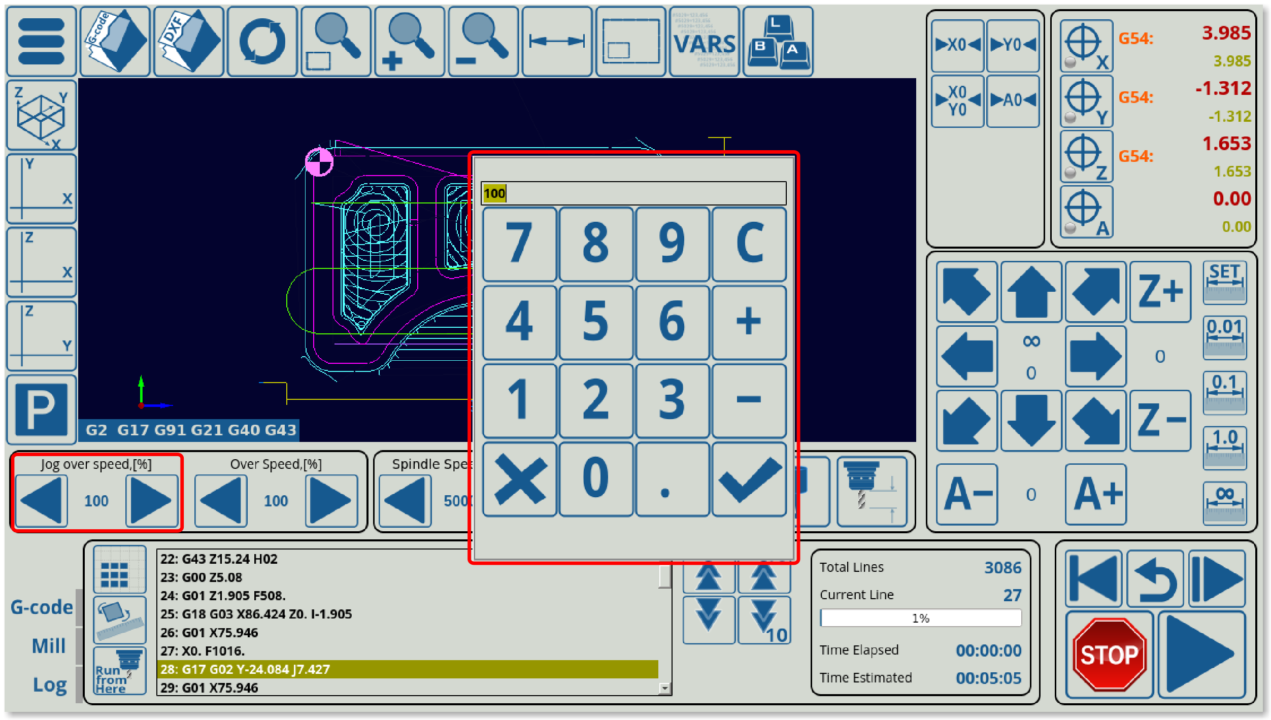
KSpinBox2 allows the user to add an element similar to a regular KSpinBox, displaying a value between two arrows, which also allows the user to click on the current value and change it using a popup screen in addition to changing the value by pressing the respective arrows. This element is used, for example, on the main screen of myCNC software's 1366M4 profile to change overspeed, jog overspeed, and spindle speed (safe range for overspeed values is 1 to 125% on the ET6, ET7 and ET10 controllers). Below is an example of such a screen element when the value in the jog overspeed box has been clicked, bringing up a popup screen:
Example KSpinBox2 code:
  <gitem fgColor="##f-display" position="880;560" height="60" width="320"
  where="main" suffix="%" format="%d" K="1."
  action="jog-overspeed-dec;jog-overspeed-inc" type="kspinbox2"
  name="display-jog-overspeed" bgColor="black" fontStyle="bold"
  labelFontSize="14" displayWidth="100" labelWidth="100" orientation="horizontal">
     <message>Jog over speed</message>
     <message_pl>Przekroczenie prędkości przesuwu</message_pl>
     <message_ru>Ручное/Скорость</message_ru>
     <message_vn>Chạy bộ trên tốc độ</message_vn>
     <message_es>Jog over speed</message_es>
  </gitem>
- fgColor specifies the foreground colour, bgColor specifies the background colour of the on-screen element
- position specifies where in the window the element will be inserted, height and width specify the size of the element
- where designates the window tab into which the element is inserted (in this case, main). The position which was previously specified is noted in relation to this window tab, not the entire myCNC window.
- format describes how the value will be presented to the user. %d stands for integer while %f stands for float. K specifies the coefficient by which the value will be multiplied by before displaying it to the user. Here, the coefficient is set to 1 to display the actual value.
- action lists the two actions which take place when the left arrow and the right arrow buttons are pressed respectively. Here, jog-overspeed-dec is assigned to the left arrow button, and jog-overspeed-inc is assigned to the right button.
- type is set to kspinbox2
- name points to the value that will be displayed. This can be a global variable, as seen in the KDisplay and Radio2Display examples above, or it can be an item, as described in the Common Item List. In this example, the value displayed will be the jog-overspeed item.
- fontStyle is set to bold, labelFontSize is set separately, as is displayWidth and labelWidth
- orientation can be set to be horizontal or vertical
- the message can be listed in different languages, the system will automatically display the correct message depending on the user language settings for myCNC
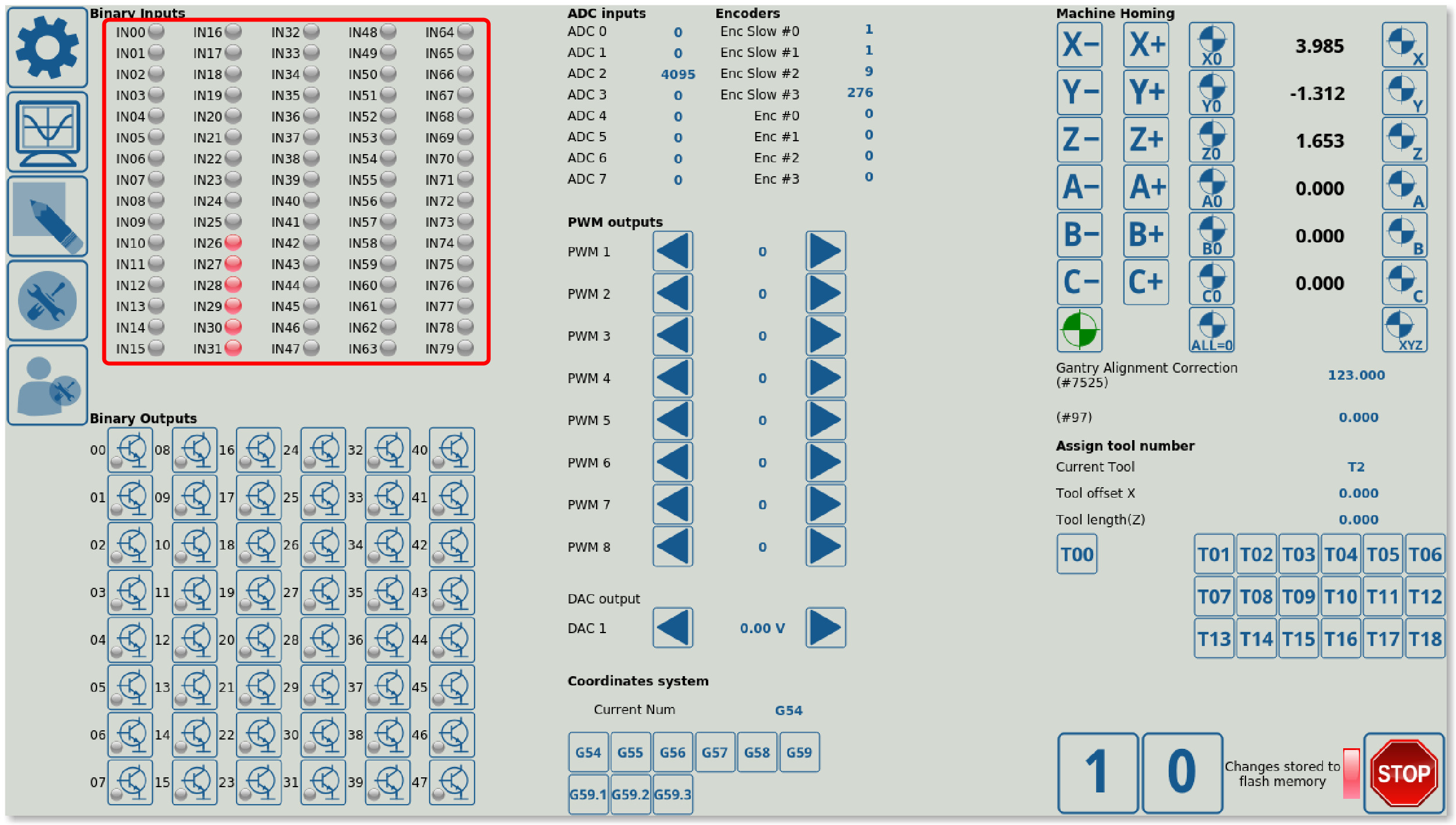
LED Display allows the user to display an LED element on the screen. This light can be on or off, and each LED element can have a different colour set for its ON configuration. This is useful to show the state of system items which have a binary state (on or off), such as input ports which can be viewed from the Diagnostics page:
Below is an example of LED display code for an LED element which will display the state of Input #0 (on or off):
<gitem inversion="no"
  labelFgColor="##f-label" labelAlignment="right;vcenter"
  where="inputs-0" height="20" address="inputs"
  shape="round" number="0" type="led">
    <message>IN00</message>
    <message_es>IN00</message_es>
</gitem>
- inversion indicates whether the LED behaviour will be “inverted” - if ON is set to be registered as OFF for visual purposes, and vice versa.
- where specifies the section of the window where the LED element will be located (inputs-0 in this case)
- address specifies the physical controller hardware that the element will receive its information from (“inputs” in this example)
- shape can be set to be round, or left at square by default (if no shape has been specified). An example of a square LED can be seen at the bottom right of the Diagnostics page, to display whether recent changes have been saved to flash memory:
- number specifies the particular hardware port in the specified hardware section (inputs in this example) that will be monitored. Here, the state of port 0 will be monitored.
- type is set to “led”
SVG Display allows to display a set of images that will be changing depending on the user input (cycling through the available images). This allows for more granular control than an LED Display element which can only show two states of a system.
Example code:
<gitem where="adc" format="%d" displayWidth="200"
 displayHeight="30"
 name="display-cnc-gvariable-7199"
 imagesfolder="progress/" loop="no" images="vprogress*"
 type="svgdisplay"  min="0" max="4096" K="1" />
- where describes the section in which the element will be inserted
- position describes the location of the element within that section
- imagesfolder specifies the folder from which the displayed images will be taken
- loop allows to loop the value count. For example, if the range is specified from 0 to 100, and the loop is set to =“yes”, then the 101 value will cause the loop to cycle through again, and the system will display it at its lowest point (looping every 100 units).
- images specifies the particular images which will be retrieved from the folder. In this case, any images that start with “volume” are used and are cycled in order.
- type is set to “svgdisplay”
- K is the coefficient by which the value will be multiplied by before it is used by the element
- min and max values specify the bounds for the values which are used. Anything lower than the min value is assumed to be equal to min (displays the first image on the list), everything higher than the max value is assumed to be equal to max (displays the last image on the list).
The Myitems widget allows the user to create a section or a window within the main myCNC screen which can later be filled with buttons/display elements/etc. The Myitems widget will serve as a container which can easily be moved on the screen, opened and closed without having to write additional code for the buttons which are inside the widget if simple changes to the widget size/location are required. Most window elements are done using a myitems widget, for example, the oil change section of the window in the User Settings:
Example code:
<gitem  where="oil-change-frame" name="oil-change" bgColor="##b-widget"  type="myitems"
 position="10;10" width="490" height="230" />

<include>oil-change.xml</include>
- note that the window (oil-change) is itself inside another widget (oil-change-frame), specified in the where line. Myitem widgets can be inserted into other Myitem widgets, allowing the user to create windows within windows.
- name will specify the name of the myitems widget which can later be used to insert buttons and other display elements into it through the where line for each of these particular elements (therefore things like KDisplay, BDisplay, etc can be inserted into this new window).
- type is set as “myitems”
- position is set in pixels within the window/widget that this new myitems element will be. In this case, it will be 10 pixels lower and 10 pixels to the right from the frame (which is its own separate element in this case). This allows for easy alignment.
- it is necessary to include the actual code for the widget that will be inserted (oil-change.xml). That file contains all the necessary information about what's inside the widget, however it is not necessary to edit it if the entire widget needs to be moved or removed from the screen.
Note that while the myitems screen element from the example above is its own element, it is also embedded into a separate on-screen element called the border. This border is a frame around an element (typically with rounded corners) and it allows for an easy visual separation between different on-screen elements.
As mentioned, an example of a border can be seen around the oil change section in the user settings tab of the X1366M/M4 profiles:
Sample border code is available here:
  <gitem  where="user-widget" name="oil-change-frame"
  bgColor="##b-main" type="frame" border-color="##b-border"
  border-width="2" border-radius="10"
  position="450;420" width="510" height="250"
  basewidth="510" baseheight="250"/>
- where specifies that the frame will be inserted into the user-widget (the User Settings window is itself a widget on the main screen).
- bgColor and border-color specify the background and border colours respectively
- border-width and border-radius specify the border measurements
- basewidth and baseheight are specified to serve as reference width and height during the window resizing process. The system will look at the basewidth/baseheight, and compare that with the actual current width and height of the on-screen widget element. This will allow to position other elements (which are inside the widget) correctly, according to the difference between the default (base) and the actual width and height of the program window.
A skin is a parameter which effectively serves as a background for the element within which it is embedded.
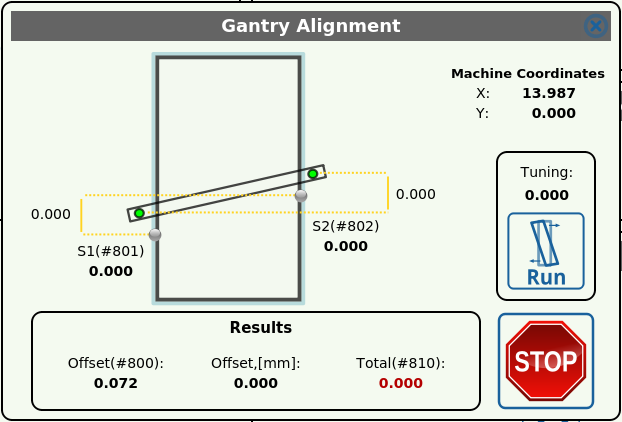
Example of a skin can be seen in the Gantry Alignment widget:
The background of the widget consists of a diagram of the machine. This diagram is embedded using the skin parameter.
Example code:
<gitem  where="gantry-border" name="gantry-widget" bgColor="##b-widget"  type="myitems"
skin="gantry/gantry"
position="10;10" width="600" height="400" />
- where specifies the element within which the new element is embedded
- name should be chosen to be unique
- bgColor specifies the background colour of the element
- type is set to
myitems(discussed in the other section of this manual) - skin is set to the image path within the art/buttons-no-theme folder
- position specifies the position in the element within which the item is located
- width and height specify the size
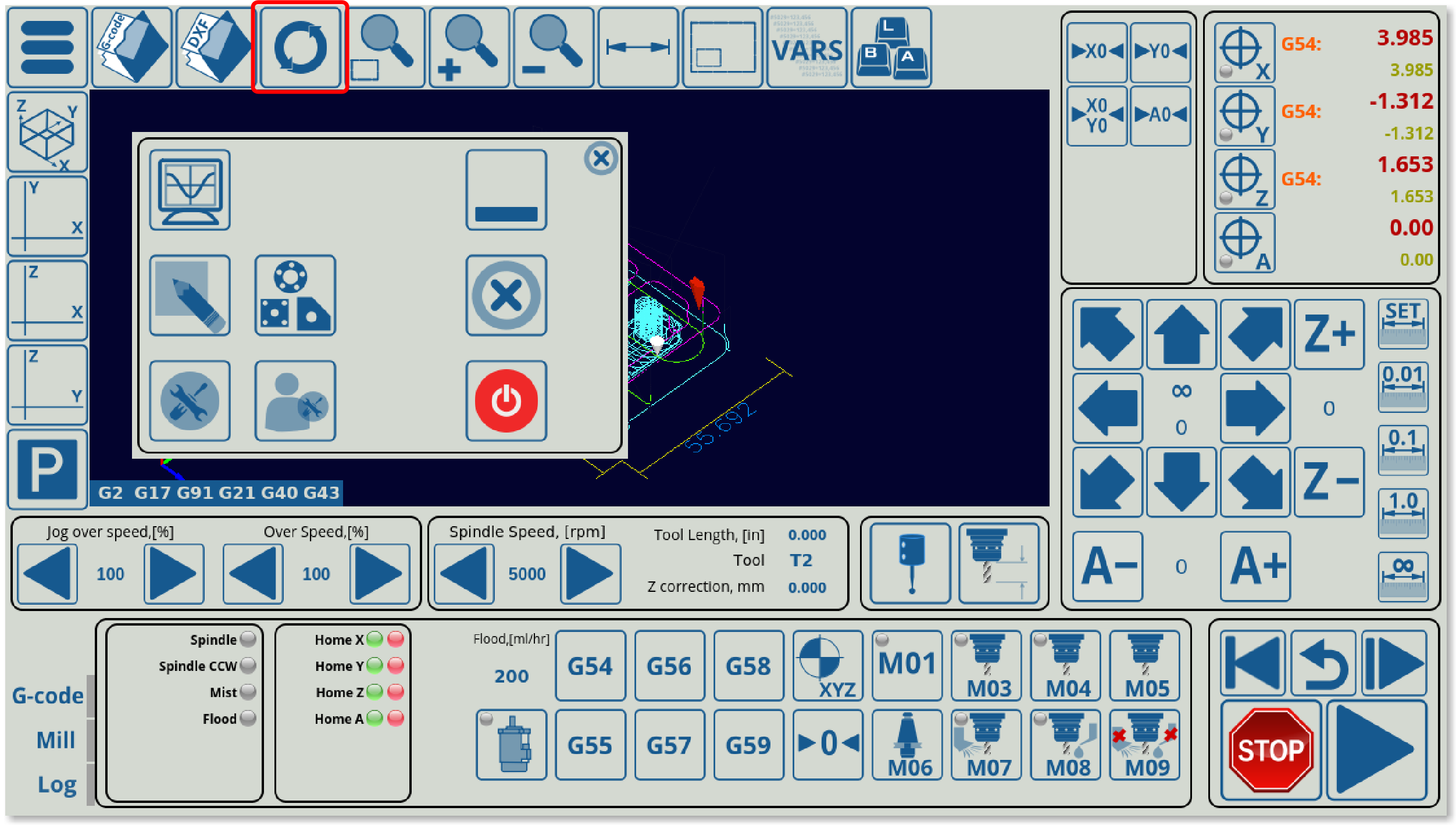
A PushButton screen item can be used on myCNC screen to serve as as a button which will trigger some command when pressed. For example, the refresh button can be seen on the main screen of the myCNC software:
The code for such a button will look as follows:
 <gitem where="main"
 position="160;0" width="80" height="80"
 image="button-refresh" action="file-refresh" type="button" />
A text element can serve as a button as well as an icon, with the following code being an example of such a layout:
<gitem where="ns" title="LOAD" fontFamily="Open Sans" fontSize="18" fontStyle="normal"
 image-normal="ns3/button-133x40" image-hovered="ns3/button-133x40" action="open" type="button"
 position="4;340"
 width="133" height="40" />
The button in the case of the example above will look the following way:
In here, the overlay element is the title line, which will display some text on the user's screen, while the underlying layer is composed of an image (using image-normal and image-hovered). If so desired, a button with no image layer can be created by simply using the title element alone.
Attributes description
- where - parent widget name that the button is placed into (in this example, it is placed in the main window)
- position - X and Y position of the button inside a parent widget (inside “main” in this case)
- width - button width in pixels
- height - button height in pixels
- type - type definition of the item (should be type=“button”)
- title - text element overlay on the button
- image - a image (icon) file for the button in the SVG format
- action - action for the button (which procedure will be executed if the button is pressed)
- event - event type the button is sensitive to. Event can be:
- pressed - action is executed if the button is pressed
- released - action is executed if the button is released
- both - there are separate actions (“;” semicolon separated) for pressed and released events
- skinbase - besides the Image file for each button there is a common skin SVG file for all the buttons. For selected buttons skin file can be redefined with skinbase attribute which specifies the border/mask which the button will be used with. This SVG file will be used as a bottom layer for the button image.
- A skinbase set equal to “transparent” will remove the border around a button or an on-screen element.
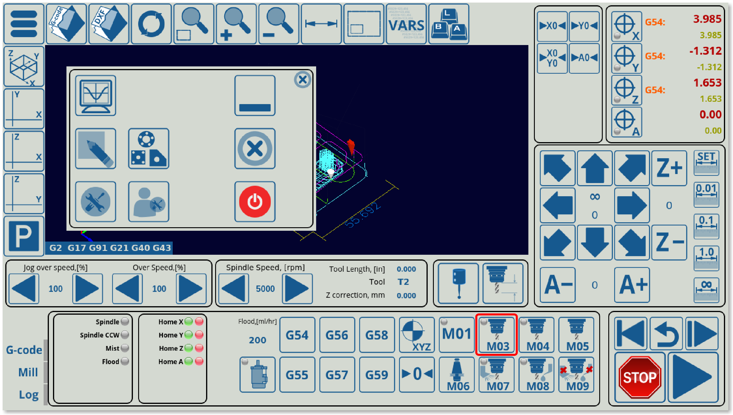
XButton is a Push button (similar to a typical button described above) with a built-in light indicator. The light is typically used to show the current state of some CNC controller input, output pin, or CNC global variable register value. Effectively, this combines the Button and LED Display elements, for example, in the M03 button in the 1366M4 profile.
An XButton XML sample code is shown below:
<gitem where="x-mill"
 xattr="3;3;16;16;led;red;round"
 address="outputs" number="#OUTPUT_SPINDLE"
 position="720;10" width="70" height="70"
 image="M/button-m03" action="plc-run:M03/#5524"
 type="xbutton" />
Attributes description
- where - parent widget name the button placed to (in this case, the x-mill widget)
- position - X and Y position of the button inside a parent widget
- width - button width in pixels
- height - button height in pixels
- type - type definition of the item (should be type=“xbutton”)
- image - a image (icon) file in SVG format for the button
- action - action for the button (which procedure will be executed if event triggered)
- event - event type the button is sensitive to. Event can be
- pressed - action is executed if the button has been pressed
- released - action is executed if the button released
- both - there are separate actions (“;” semicolon separated) for pressed and released events
- skinbase - besides the Image file for each button there is a common skin SVG file for all the buttons. For selected buttons skin file can be redefined with skinbase attribute. This SVG file will be used as a bottom layer for the button image.
- xattr - defines light position size and attributes - semicolon separated
- X,Y position of the led/light inside the button
- width and height of the led
- type of light (actually this field is always “led”, reserved for future options)
- shape of the standard LED light. A standard shape can be “round” and “rect”
- address - defines CNC controller hardware the light attached to
- “inputs” - the light is “attached” to an input pin
- “outputs” - the light is “attached” to an output pin
- “number” - defines the pin number than the light is attached to. A number can be assigned directly, for example
number=“0” for pin #0
number=“15” for ipn #15
or through pin definition file used in Hardware PLC - “pins.h”. In this case sign “#” and the pin name defined in “pins.h” should be instead of pin number. For example
number=“#OUTPUT_SPINDLE”
and “pins.h should contain this name definition, for example#define OUTPUT_SPINDLE 7
Another example of an xbutton realized with a ref value for reference to switch (toggle) a variable between two states:
<gitem where="x-reserv" position="85;5" width="80" height="80"
 image="rect/normal"
 image-hovered="rect/hovered"
 action="cnc-gvariable-switch-5701"
 xattr="0;0;80;80;led;red;round" name="display-cnc-gvariable-5701" data="---;1;16" ref="16" tooltip="Sheet/tube cutting" images="mode-sheet;mode-tube"
 type="xbutton"/>
- data specifies which values the switch is occuring (the cnc-gvariable-switch-5701 action in this case)
- ref specifies the reference value to monitor for
Similarly, a refx value can be used to switch an LED/xbutton between the OFF and ON states. A code of refx=“5”, for instance, will signify that the LED will be ON for values equal to OR HIGHER than 5.
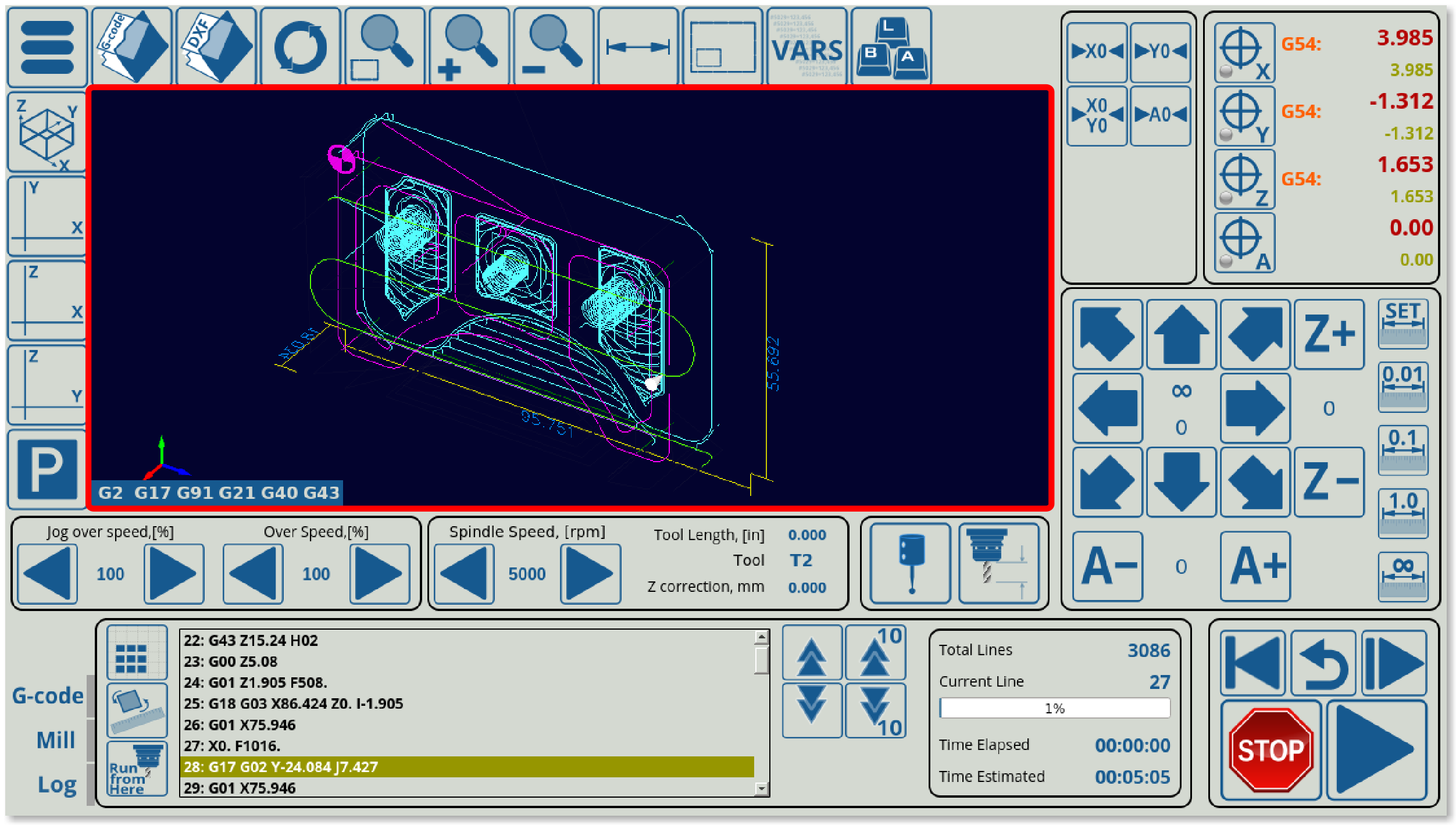
GLView allows to display a 3D visualization window which will show a visualization of the imported program (such as the window on the main screen of myCNC software's 1366M4 profile).
Sample GLView code is shown below:
 <gitem where="xp" name="glview" type="glview" position="80;80" width="910" height="395"
 singlepath="no" bgColor="##b-ncview"
 ColorT0="white:1" ColorT1="#00DD00:1" ColorT2="#0000DD:1" ColorT3="#DDDD00:1"
 ColorT4="#00DDDD:1" ColorT5="#00DD00:1" ColorT6="#DD5500:1"
 HColorT0="transparent:0" HColorT1="#DD0000:3" HColorT2="#0000DD:3" HColorT3="#DDDD00:3"
 HColorT4="#DD00DD:3" HColorT5="#00DD00:3" HColorT6="#DD5500:3"  ></gitem>
- type is set to glview
- name is also set to glview in order to allow other widgets to reference this window
- position, width and height specify the location and dimensions of the visualization window (in pixels)
- singlepath can be set to yes or no. This is only useful on the NCView window (2D visualization program described below)
- ColorT0, T1, etc describe the visualization colours for different tools in the G-code
- HColorT0, T1, etc describes the highlight colour for the selected tool
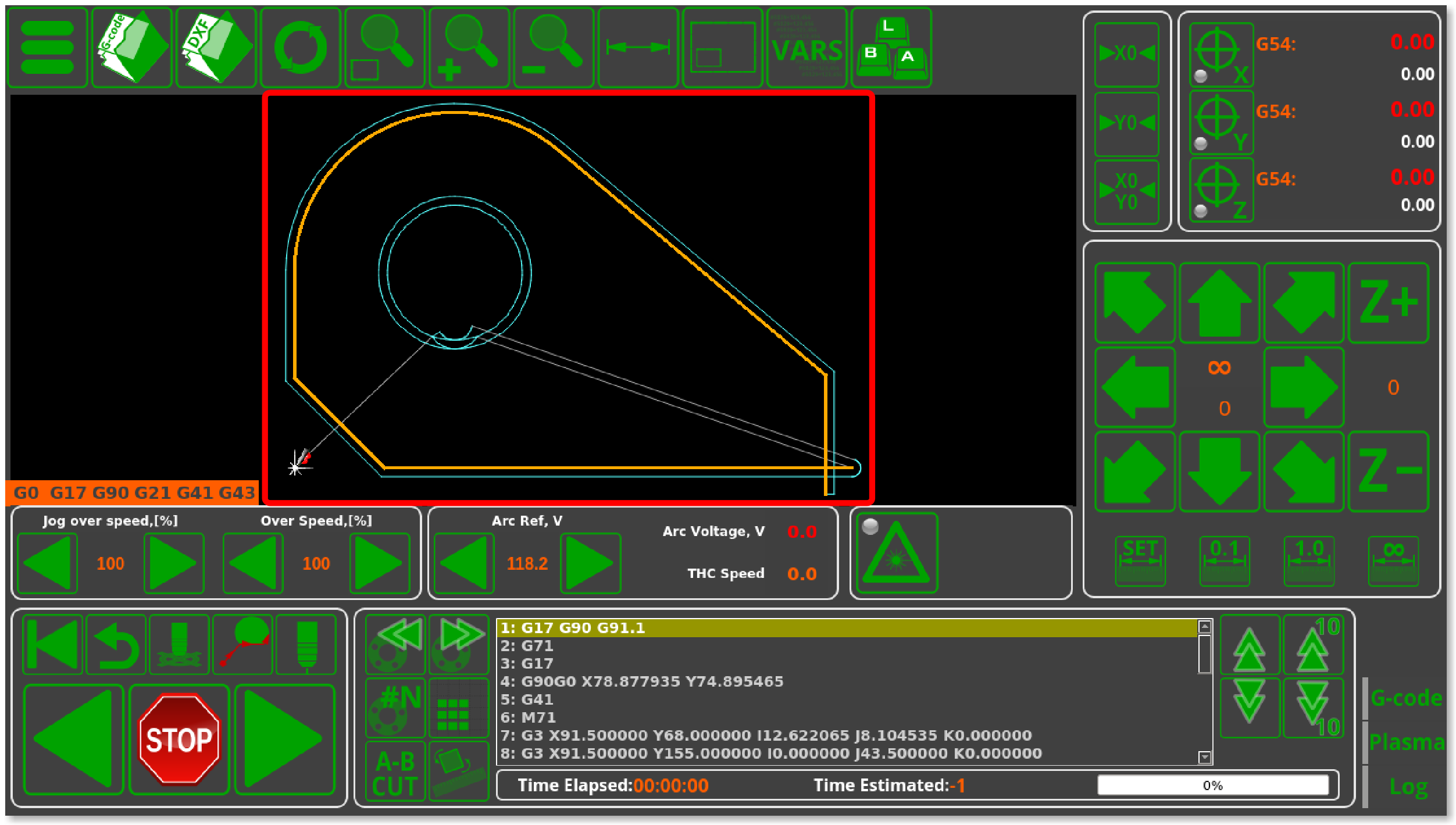
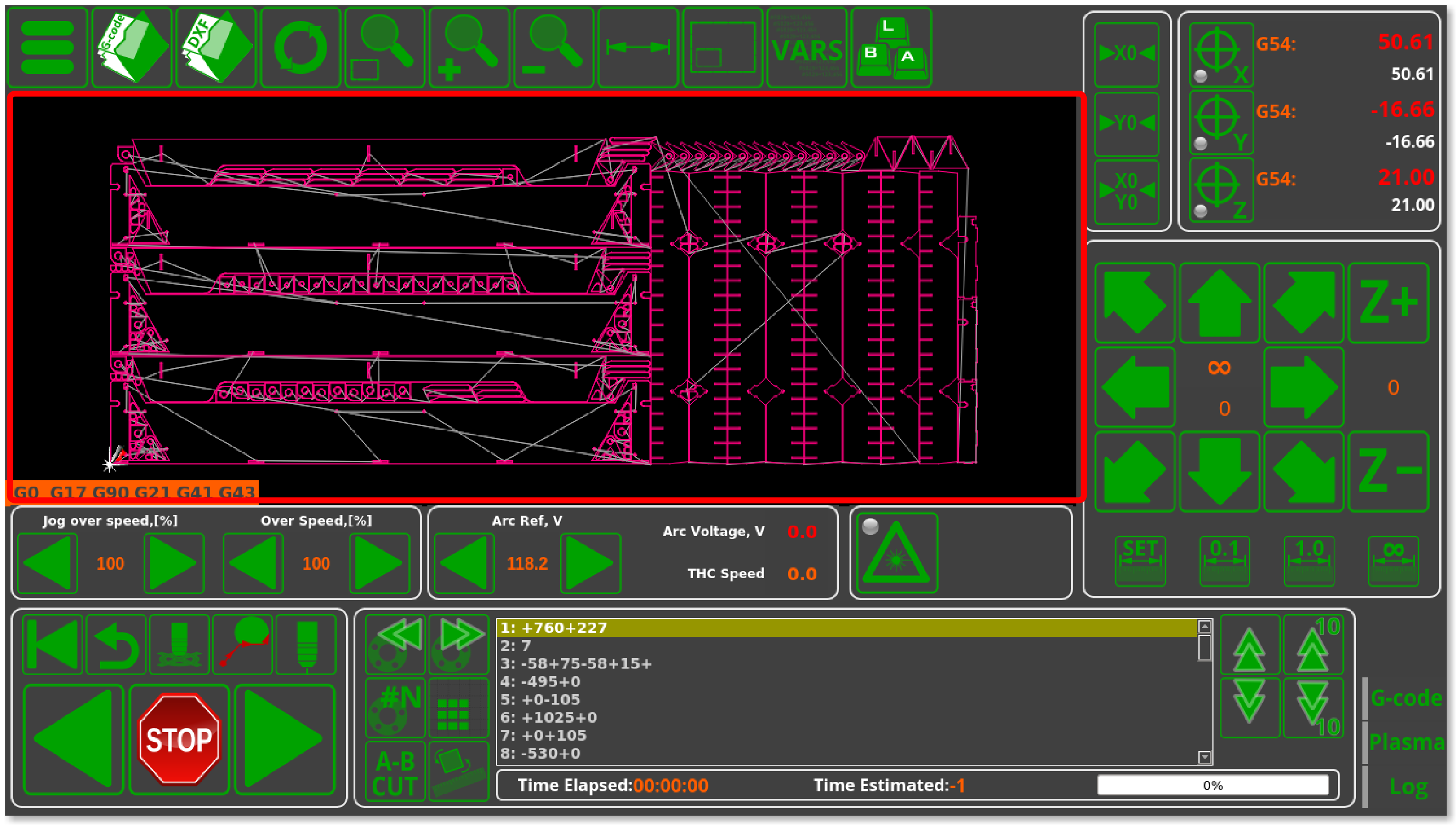 NCView is the 2D visualization widget to display an image of the imported G-code file such as the main visualization window in the 1366P profile (as a 3D visualization is unnecessary for a plasma/gas profile which will be doing all the cutting in the XY plane only).
Below is the code used to display an NCView window in the 1366P plasma profile.
<gitem where="xp" name="ncview" type="ncview" position="5;85" width="1010" height="390"
 singlepath="no" bgColor="##b-ncview"
 ColorT0="white:1" ColorT1="#00DD00:1" ColorT2="#0000DD:1" ColorT3="#DDDD00:1"
 ColorT4="#00DDDD:1" ColorT5="#00DD00:1" ColorT6="#DD5500:1"
 HColorT0="transparent:0" HColorT1="#DD0000:3" HColorT2="#0000DD:3" HColorT3="#DDDD00:3"
 HColorT4="#DD00DD:3" HColorT5="#00DD00:3" HColorT6="#DD5500:3"  ></gitem>
- type is set to “ncview”
- position, width and height specify the location and dimensions of the visualization window (in pixels)
- singlepath can be set to yes or no. Typically, it is set to be off, so as to display kerf compensation (if there is any kerf compensation present). If set to on, kerf compensation will not be visible (similar to the window shown during file import when a 2D G-code file is being imported into myCNC).
- ColorT0, T1, etc signify the tool colours in the visualization (light blue in this case)
- HColor signifies the highlight colour for each tool (colour of the tool visualization when selected - yellow in this case)
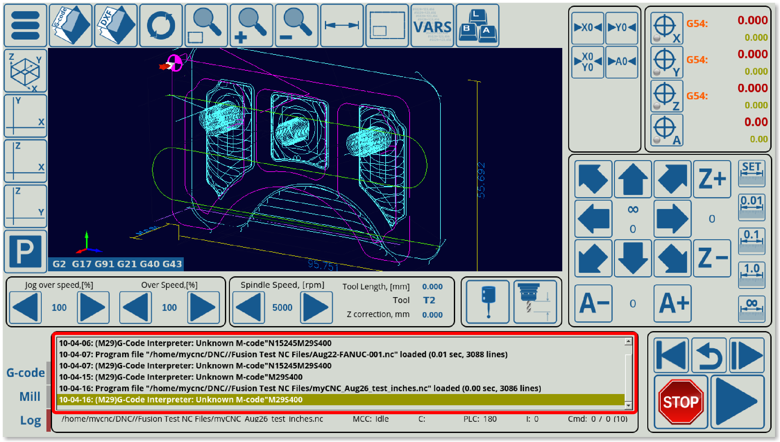
Logview is the log window tab at the bottom of the main screen of myCNC software (within the x-log widget). It contains information on program start and end times, error messages, etc.
Example code code to insert the log window as it is displayed in the 1366M4 profile is the following:
<gitem where="x-log" position="10;10"
 width="930" height="160"  name="logview" type="logview"></gitem>
- position describes the location of the logview element withing the x-log widget
- position, width and height specify the parameters of the window within the x-log widget.
- name and type are set to “logview”
This will insert the Logview element into the x-log MyItems widget.
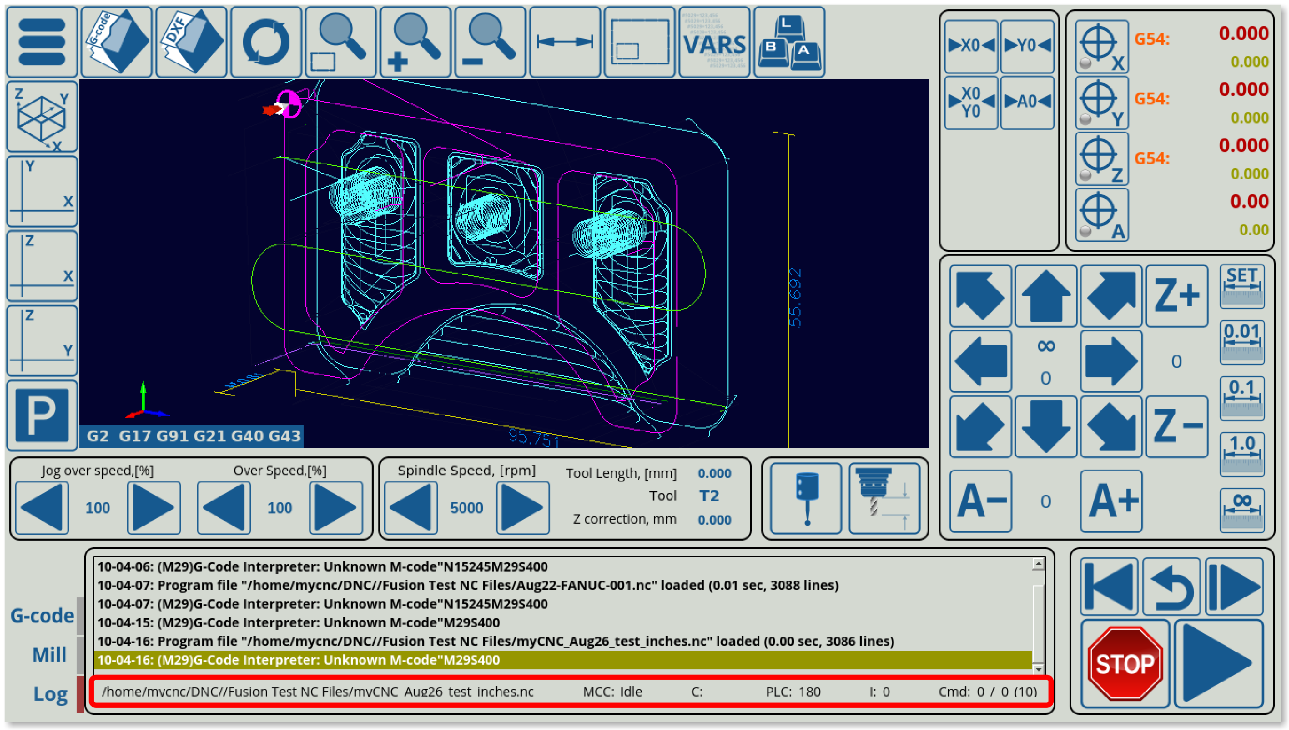
Below the logview window, a status bar can be seen:
This is inserted into the x-log widget separately from logview, through the following code:
<gitem where="x-log" position="10;140" width="930" height="30" fontSize="16"
 fontStyle="normal" name="statusbar" type="statusbar" />
- where points out that the status bar is inserted into the x-log widget, same as the Logview element.
- name and type are set to “statusbar”
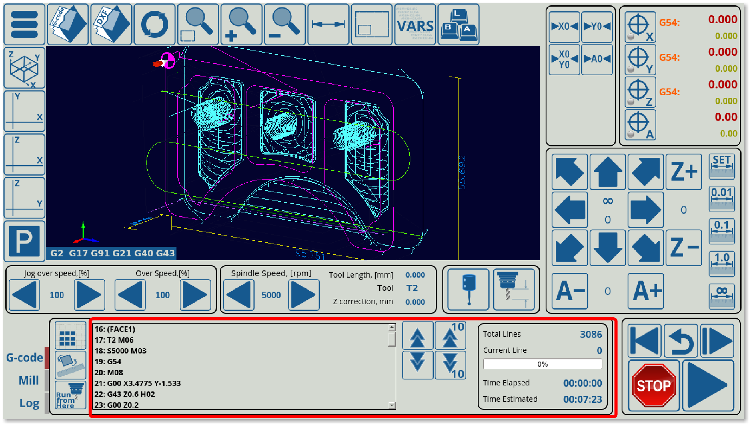
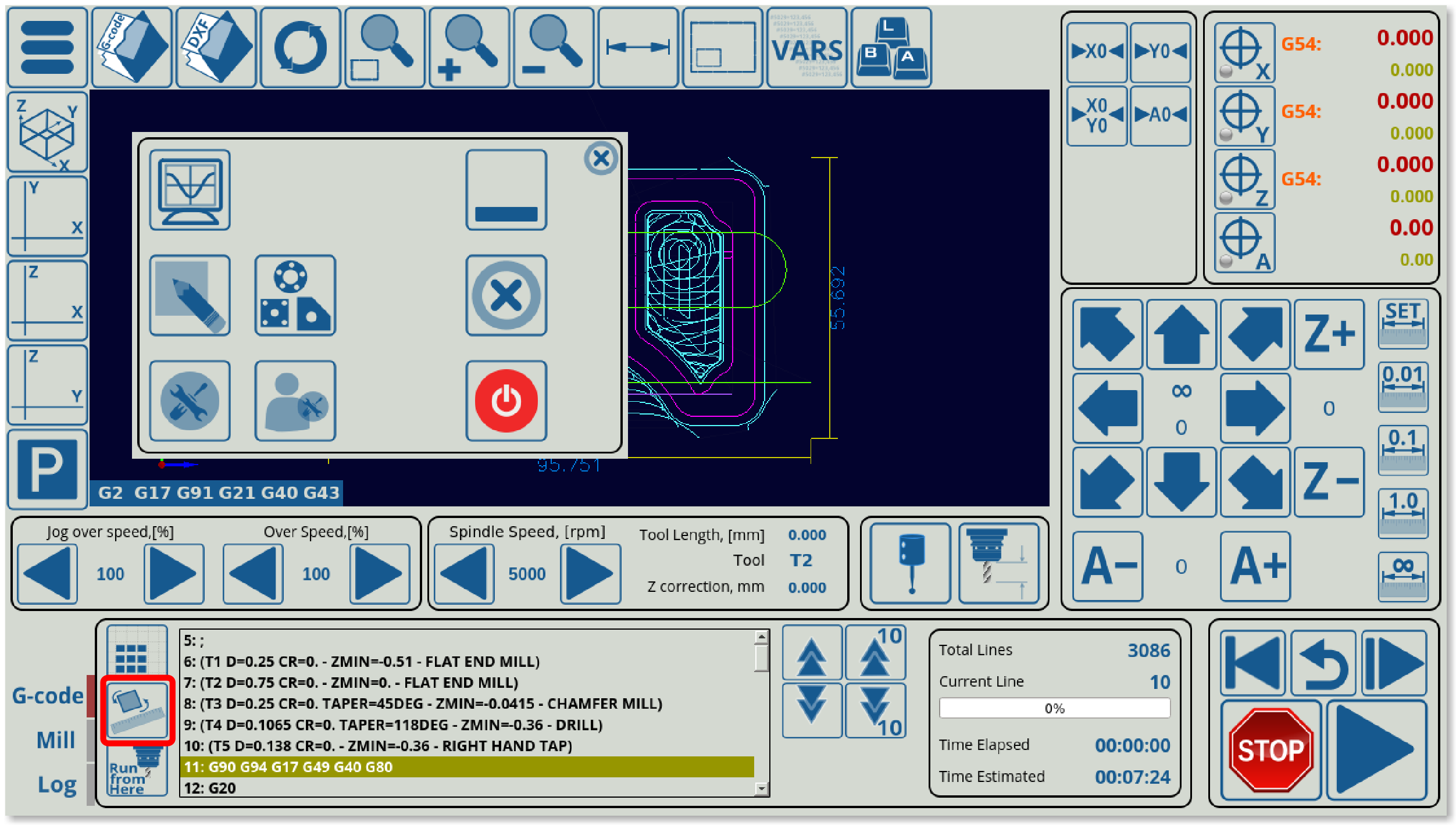
The NCList widget is used to display the G-code commands window to the user, as can be seen in the G-code tab on the main screen of the 1366M4 profile, as well as the nesting, rotation and Run From Here buttons:
Example code to insert the NCList window:
<gitem where="xp" name="x-nclist" position="330;581"
 width="950" height="180" basewidth="950" baseheight="180"
 type="frame" border-color="##b-border" border-width="2" border-radius="10"
 bgColor="##b-main" hide-list="x-log;x-mill" exclusive="yes" />
- type=“frame” allows to draw a frame border around the NCList window.
- hide-list serves as an option to hide the x-log and x-mill windows when the NCList window is active (as they are all situated in the same area). The exclusive flag signifies that only the NCList widget will be up on the screen if it is selected, thus allowing to not interfere with x-log and x-mill windows (the same setting is present in both other respective windows).
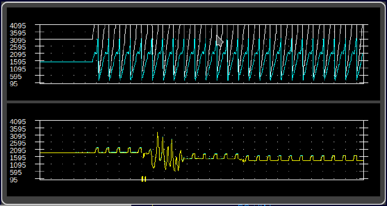
The myscope screen element allows the user to display time graphs of information received by the myCNC application. The graphs will look similar to the following image:
Sample code to add a myscope element to the myCNC screen:
 <gitem where="xp" name="x-graph" position="90;90"
 width="680" height="360" basewidth="680" baseheight="360" hidden="yes"
 type="frame" border-color="##b-border" border-width="2" border-radius="10"
 bgColor="##b-main"  />


<gitem where="x-graph" position="10;10" width="660" height="165"
 name="myscope1" type="myscope" yrange="0;4095" K="1"
 source="adc0;adc1" sampling="50" />
- where indicated into which screen element the myscope graph will be inserted (in this example, it will be inserted into a border called
x-graph). - position indicates the XY position within the element into which it is inserted
- width and height indicate the size of the graph
- name should be a unique name
- type should be set to
myscope - yrange will specify the Y-axis range of the graph
- K will specify the coefficient by which the necessary information will be multiplied by before being displayed
- source is the name of the port or the variable which will be monitored. A list of possible sources is provided below.
- sampling specifies the rate at which the information will be retrieved (in this example, the graph will be updated every 50 milliseconds)
| Source | Description |
|---|---|
| adc0 | ADC #0. adc0 through adc7 are available |
| pwm0 | PWM #0. pwm0 through pwm7 are available |
| multidev-adc0 | ADC #0 of the slave controller (if multiple devices are used). multidev-adc0 through multidev-adc7 are available |
| speed-xyz | Movement speed of the machine |
| speed-abc | Rotation movement speed of the machine |
| thc-control | THC system speed |
| thc-reference | THC Reference voltage |
| thc-sensor | THC Arc Voltage |
| data-counter | Reserved for future implementation |
| time-counter | Reserved for future implementation |
| cnc-gvariable- | Monitor a myCNC global variable. The variable should be included after the dash, such as in cnc-gvariable-7010 |
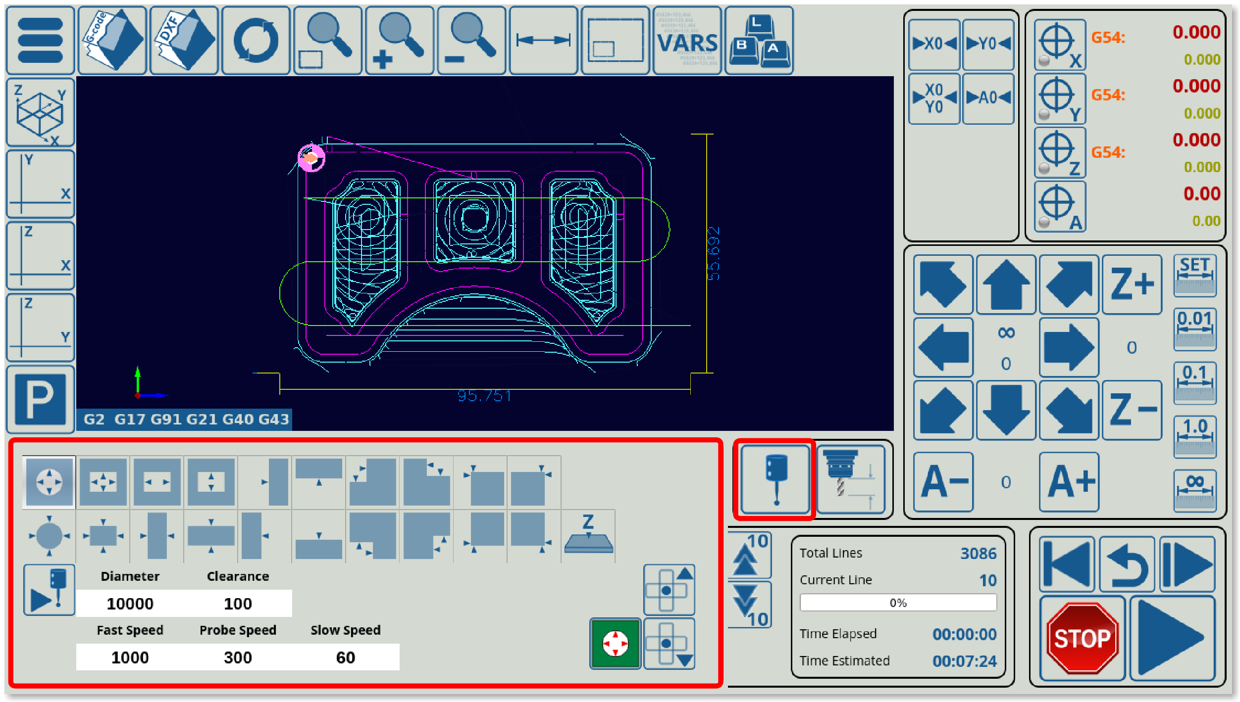
CentringView consists of the probe tools which allow to center the machine tool with regards to some obstacles. The window is brought up by clicking the Probe Sensor Window button:
The code to insert such a window into the 1366M4 profile, the following code is used:
  <gitem where="x-reserv"
  position="8;5" width="80" height="80" image="probing/centring-unit"
  action="mywidget-toggle:x-centring" type="button"/>
Note that this will bring up the x-centring.xml file which describes what is actually inside the CentringView widget. This code merely indicates that the Probe Sensor Window button is to be placed on the main screen, pressing which will, in turn, bring up the CentringView widget screen.
- where is set to “x-reserv”
- image is used for the button to indicate what the button action will be to the user
- action specifies the command which will be perform when the button is pressed (in this case, the button toggles the visibility of the x-centring widget (found in the x-centring.xml file)
- type is set to “button”
Rotation2View is the window which allows to rotate the program part by some degree. It is brought up by clicking the Rotate button in the G-code tab on the main screen of myCNC software:
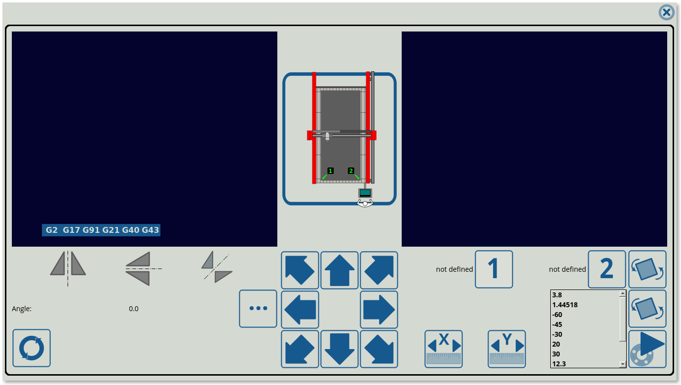
The following window is brought up when clicking the button (window functions described here):
This will bring up the x-rotate.xml file which further describes internals of the window. In order to simply add a button so that the overall window can be brought up, the following code can be used:
  <gitem where="x-nclist" position="10;60" height="55" width="60"
  image="tabs/rotate-r" action="mywidget-toggle:x-rotate" type="button"></gitem>
- where points to the x-nclist widget (describe above) which inserts this button into it
- position, height and width describe the button parameters within the x-nclist widget
- action specifies that pressing this button will toggle the x-rotate window visibility
- type is set to “button”
Sample code for the rotation2view element:
<gitem where=“rotateborder” position=“5;5” width=“1346” height=“703” basewidth=“1346” baseheight=“703” table-rotation=“0” type=“rotation2view” name=“rotation2view” bgColor=”##b-main“ ></gitem>
- position describes the XY location within the where element
- width and height describe the element's parameters in pixels
- table-rotation sets the orientation of the table. -90 and 90 are the typical values to rotate the orientation
- type is set to rotation2view
Timeview allows the user to add a clock within their myCNC software, for easy time monitoring (useful when program is in full-screen mode, for example).
Sample XML code:
<gitem where="xp" position="880;0" width="120"
height="80" type="timeview" fontStyle="bold"></gitem>
The following image provides an example of the timeview displayed in one of the myCNC profiles:
NOTE: The timeview functionality is a remnant of older builds of myCNC software, and does not support font and background colour selection.
<gitem where="map-z-frame" position="10;10"
 displayWidth="100" width="100" height="25" displayAlignment="_center"
 fgColor="##f-display" fontFamily="Open Sans" fontSize="20"
 type="time-display" deviation="0.5"
 name="display-cnc-gvariable-6120"
 bgColor="##b-display" fontStyle="bold">
</gitem>

<gitem where="map-z-frame" position="10;40"..
 displayWidth="100" width="100" height="30" displayAlignment="_center"
 fgColor="##f-display" fontFamily="Open Sans" fontSize="20"
 type="time-display" deviation="0.5"
 name="display-cnc-gvariable-6130" bgColor="##b-display" fontStyle="bold">
</gitem>
The time-display UI element allows the system to display a global variable (in case of this example, #6120 and #6130 for the working time of ATC Pots #1 and #2) in a 00:00:00 format.
A password widget allows the user to create a hidden locked GUI element that is displayed after entering the correct password. This is similar to the Settings Lock option in terms of functionality (as it is typically done to prevent access of important sections of the software/profile), however unlike locking the Configuration dialogs, the password widget allows the user to lock a particular widget right on the main profile screen.
When the element is clicked/pressed, the passcode window appears:
A code example of such an element is displayed below. Note how there are two elements - the bdisplay element (for password entry) with a cnc-password-widget- action, and a second frame element with an ID (in this case, id=“77”):
<gitem where="xp" position="100;100"
 width="190" displayWidth="190" height="22"  displayAlignment="_center" fgColor="##f-label" format="%d"
 fontFamily="Open Sans" fontSize="14" type="bdisplay" deviation="0.5" fontStyle="bold" bgColor="##b-main"
 action="cnc-password-widget-77/123579/%v"  />

<gitem where="xp" position="100;150"
 width="300" height="50" basewidth="300" baseheight="50"
 type="frame" border-color="##b-border" border-width="4" border-radius="0"
 hidden="1" id="77" name="x-menu-hidden" bgColor="red" />
In the example above, the password is set to be 123, and both the UI elements are located in the same “container” (xp). However, the password can also be changed, and the elements can be placed in different frames/myitems widgets (the container UI element must not necessarily be the same). Note how the ID is mentioned in both the cnc-password-widget bdisplay element and the frame UI element - without this, the two cannot be linked as there is no way for the system to recognize what the cnc-password-widget is pointing to.
<gitem where="xp" name="split" bgColor="##b-main" type="splitview".
      position="0;45" width="1155" height="723" basewidth="1155" baseheight="723" />

      <gitem where="split" split="5" name="ncview" type="ncview"
 singlepath="no" bgColor="##b-ncview"
 ColorT0="white:1" ColorT1="#00DD00:1" ColorT2="#0000DD:1" ColorT3="#DDDD00:1"
 ColorT4="#00DDDD:1" ColorT5="#00DD00:1" ColorT6="#DD5500:1"
 HColorT0="transparent:0" HColorT1="#DD0000:3" HColorT2="#0000DD:3"
 HColorT3="#DDDD00:3"
 HColorT4="#DD00DD:3" HColorT5="#00DD00:3" HColorT6="#DD5500:3" ></gitem>

 <gitem where="split" split="-1" width="295" basewidth="295" height="723"
 baseheight="723" name="split-right"
 bgColor="##b-main" type="myitems" />
The splitview element consists of two sections (each assigned a split value, for instance split=“5”). This split parameter sets the proportions of each window. If the split is negative, then the window is assumed to have a fixed width from the width parameter.
The main feature of this GUI element is that if one of the windows is hidden, the second one will automatically occupy the entire area.
MyCNC Actions
All button-like screen components (button, xbutton, bdisplay, kspinbox2) run a Handler procedure when pressed or released event is activated by a mouse click or a touch screen tap. The Handler is defined in the “action” attribute of an XML configuration item.
| Action Name | Description |
|---|---|
| advanced-config | Brings up the full configuration dialogs window (this is the window typically accessed through Settings > Config) |
| basic-config | Obsolete, was used to bring up a basic config settings window on some systems |
| toggle-button-coordinates | Special purpose action, used to toggle between displaying program and machine coordinates (only one set of coordinates would be shown at a time) |
| toggle-button-jog-enable | This toggle allows to enable/disable jog completely (typically done for safety reasons so that the machine cannot accidentally move) |
| toggle-button-soft-limits | This action will toggle whether the soft limits for the machine will be ON or OFF. This can also be done by heading into Settings > Config > Inputs/Outputs/Sensors > Limits and setting the check mark for Soft Limits Enabled there. |
| toggle-button-mist | Coolant mist is toggled ON/OFF |
| toggle-button-flood | Coolant flood (liquid) is toggled ON/OFF |
| toggle-button-spindle | The spindle configuration uses the toggle-button-spindle and the toggle-button-ccw-spindle commands. By default, there are two commands sent to the spindle - power and direction. The power will cause the spindle to turn in the clockwise direction, while the ccw-spindle command will reverse the spin direction of the spindle. |
| toggle-button-ccw-spindle-spindle | Reverses the spin direction of the spindle (counter-clockwise instead of clockwise) |
| toggle-item: | This is a general toggle action command for any item (item name is specified after the colon). Item list can be found here. |
| laser-marker- | Special purpose action reserved for laser marker machines. This action perform a test run in anticipation of the actual cutting process. |
| generate-pierce-array | EXPERIMENTAL FEATURE. This action goes through the control program and removes the cutting sections, leaving only the pierce points and idle movements between those points. Commisioned for a client's gas cutting machine |
| system-process |
Items are a subset of actions, and are written in the following form - item:item-name (such as item:motion-rapid-speed-xy). Items are different from actions in that items effectively describe a value that can be changed by some input (similar to Global Variables which store a value). In this way, there can exist both an action with some name, and an item with that same name, which are separate from one another (one will describe an action that will be taken, and the other will describe a value that will be changed by that action).
Items are often presented to the user on the myCNC software screen to display relevant information which can then be edited (such as the jog overspeed, spindle speed, etc). The relevant actions for such items would be along the lines of motion-overspeed-inc or motion-overspeed-dec, describing a particular action to perform with this item (value).
Items are typically used in conjunction with some input, as outlined in the Connections configuration dialog which can be found here.
A list of commonly used items can be found in the Item List.
| Action Name | Description |
|---|---|
| player-play | Begins running the program |
| player-play-confirm | Begins running the program after a confirmation popup has been clicked, to confirm that the user indeed wants to start the program run |
| player-play-edge | Begins running the program from the edge (done for plasma profiles on thick materials/when initial pierce or ignition is not possible at some point). |
| player-play-edge-confirm | Begins running the program from the edge after a confirmation popup to ensure that the user wants to start from the edge |
| player-jump1 | Special purpose command, done to jump to the first cutting/piercing point in the program. Used on select user profiles. |
| player-pause | Pauses the program run |
| player-stop | Stops the program run. In myCNC, player-pause and player-stop are equivalent, as the controller remembers the machine position as the program is stopped, thus allowing it to serve as a pause |
| player-skip-forward | Skips to the next G-code command |
| player-skip-forward-10 | Skips 10 commands (forward direction) |
| player-skip-backward | Goes to the previous G-code command |
| player-skip-backward-10 | Skips 10 commands (backwards direction) |
| player-skip-part-f | Skips to the next part in the code |
| player-skip-part-b | Skips to the previous part in the code |
| player-nc-reset | Resets the program back to the beginning |
| player-nc-reset-confirm | Resets the program back to the beginning after asking for a confirmation in the form of a popup window |
| player-back-to-path | Goes back to path after a stop |
| player-back-to-path-confirm | Goes back to path, requires confirmation before the machine goes back to path |
| player-play-back | Runs the program backwards |
| player-simulate-forward | Simulate the program running forward in a simulation/trial mode. Requires a line event=“both” to simulate while pressing the on-screen button (letting go of the button is considered an “event”. |
| player-simulate-backward | Simulate the program running backward in a simulation/trial mode. |
| player-nc-tie | Allows to tie a certain position to the reference zero program coordinate position. This allows to move the entire program around the cutting sheet. Useful when, for example, a single part needs to be cut out from a program made up from many different parts at a different location on the working material from that used originally (for example, if the first run was faulty). This calculates the difference of the current selected point and the zero program coordinate, and then interpolates the same difference between the new selected point and the new zero program coordinate, moving the whole program over. |
| player-play-step | Run through a single line of code (next line) |
| player-play-step-backward | Run through a single line of code (previous line) |
| mdi-play | If the Manual Data Input field is not presented as a separate window, it is possible to enter some MDI commands, and then keep them entered until they are required (no need to immediately execute them). This mdi-play command will execute the stored MDI process. NOTE: This is a special user case feature, typically mdi-open is used instead. |
| mdi-open | Opens the Manual Data Input window |
| Action Name | Description |
|---|---|
| jog-0-plus, jog-1-plus, jog-2-plus, jog-3-plus, jog-4-plus, jog-5-plus, jog-6-plus, jog-7-plus jog-8-plus | Positive direction jog in the in the X, Y, Z, A, B, C, U, V, W axes |
| jog-0-minus, jog-1-minus, jog-2-minus, jog-3-minus, jog-4-minus, jog-5-minus, jog-6-minus, jog-7-minus, jog-8-minus | Negative direction jog in the X,Y,Z,A,B,C,U,V,W axes |
| jog-0-plus-1-plus | Two-axes Jog, X+ Y+ |
| jog-0-plus-1-minus | Two-axes Jog, X+ Y- |
| jog-0-minus-1-plus | Two-axes Jog, X- Y+ |
| jog-0-minus-1-minus | Two-axes Jog, X- Y- |
| jog-overspeed-inc jog-overspeed-dec | Increment/Decrement Jog Overspeed value (%) - the default jog speed is set to be 100%. Safe range between 1% and 125%. |
| jog-overspeed-set: | Set given Jog Overspeed value (%). Safe range between 1% and 125%. The bounds for overspeed can be set in Settings > Config > Motion |
| Action Name | Description |
|---|---|
| step-float-inc step-float-dec | Increase/decrease Jog Step Size. Reserved for an arbitrary step size change (instead of a 0.01, 0.1, etc) |
| step-size-inc step-size-dec | Increase/decrease Jog Step Size by a set value |
| motion-linear-acceleration-inc motion-linear-acceleration-dec | Increase/decrease Motion Linear Acceleration value |
| motion-linear-jog-speed-inc motion-linear-jog-speed-dec motion-linear-jogspeed-inc motion-linear-jogspeed-dec | Increase/decrease Motion Linear Jog Speed value |
| motion-jog-speed-x-inc, motion-jog-speed-x-dec, motion-jog-speed-y-inc, motion-jog-speed-y-dec, motion-jog-speed-z-inc, motion-jog-speed-z-dec, motion-jog-speed-a-inc, motion-jog-speed-a-dec, motion-jog-speed-b-inc, motion-jog-speed-b-dec, motion-jog-speed-c-inc, motion-jog-speed-c-dec, motion-jog-speed-u-inc, motion-jog-speed-u-dec, motion-jog-speed-v-inc, motion-jog-speed-v-dec, motion-jog-speed-w-inc, motion-jog-speed-w-dec, motion-jog-speed-xy-inc, motion-jog-speed-xy-dec, motion-jog-speed-xyz-inc, motion-jog-speed-xyz-dec | Increase/decrease Motion Jog Speed value for given Axis |
| motion-rapid-speed-x-inc, motion-rapid-speed-x-dec, motion-rapid-speed-y-inc, motion-rapid-speed-y-dec, motion-rapid-speed-z-inc, motion-rapid-speed-z-dec, motion-rapid-speed-a-inc, motion-rapid-speed-a-dec, motion-rapid-speed-b-inc, motion-rapid-speed-b-dec, motion-rapid-speed-c-inc, motion-rapid-speed-c-dec, motion-rapid-speed-u-inc, motion-rapid-speed-u-dec, motion-rapid-speed-v-inc, motion-rapid-speed-v-dec, motion-rapid-speed-w-inc, motion-rapid-speed-w-dec, motion-rapid-speed-xy-inc, motion-rapid-speed-xy-dec, motion-rapid-speed-xyz-inc, motion-rapid-speed-xyz-dec | Increase/decrease Motion Rapid Speed value for given Axis |
| motion-feed-speed-x-inc, motion-feed-speed-x-dec motion-feed-speed-y-inc motion-feed-speed-y-dec motion-feed-speed-z-inc motion-feed-speed-z-dec motion-feed-speed-a-inc motion-feed-speed-a-dec motion-feed-speed-b-inc motion-feed-speed-b-dec motion-rapid-speed-c-inc motion-rapid-speed-c-dec motion-rapid-speed-u-inc motion-rapid-speed-u-dec motion-rapid-speed-v-inc motion-rapid-speed-v-dec motion-rapid-speed-w-inc motion-rapid-speed-w-dec motion-rapid-speed-xy-inc motion-rapid-speed-xy-dec motion-rapid-speed-xyz-inc motion-rapid-speed-xyz-dec | Increase/decrease Motion Rapid Speed value for given Axis |
| motion-overspeed-inc motion-overspeed-dec motion-overspeed | Increase/decrease/set Motion Overspeed value (%) |
| spindle-speed-inc spindle-speed-dec spindle-speed | Increase/decrease/set Current Spindle Speed (S) for current operation. New “S” value in running g-code will overwrite Current Spindle Speed |
| spindle-speed-restore | Restore Default Spindle Speed (S) |
| spindle-overspeed-inc spindle-overspeed-dec spindle-overspeed | Increase/decrease/set Spindle Speed (S) |
| Action Name | Description |
|---|---|
| editor-arrow-up | Go one line up in the code |
| editor-arrow-down | Go one line down in the code |
| editor-ncline-edit | Edits the current selected line of G-code |
| editor-ncline-insert | Inserts a line of code |
| editor-ncline-remove | Deletes the current selected line |
| editor-font-inc | Increase the font size for the editor G-code text |
| editor-font-dec | Decrease the font size for the editor G-code text |
| editor-numbers-toggle | Toggle the line number display to insert the current line number indicators into G-code |
| editor-selection-begin | Begin selection |
| editor-selection-end | End selection (the lines between the editor-selection-begin and editor-selection-end will be selected) |
| editor-selection-remove | Remove the selected lines |
| editor-selection-insert | Insert selected lines |
| editor-new | Create a new program file in the editor |
| editor-save-as | Save File As |
| editor-save | Save the editor file |
| Action Name | Description |
|---|---|
| save | Saves the file |
| open | Open selected file |
| load-file: | Load a file. This will load a file from the predefined folders which can be set in Config > Preferences > Common |
| load-macro: | A test debug feature. Allows to load the macros which are referenced in the imported G-code directly into the NCList window. In this way, instead of using a single macro number to refer to a specific macro, the full macros will be written out in the NCList. |
| file-close | Close the program file |
| dxf-import | Import a DXF file into myCNC |
| image-import | Import an image into myCNC |
| Action Name | Description |
|---|---|
| zoom-in | Zoom in on the visualization |
| zoom-out | Zoom out on the visualization |
| fit-to-view | Fit the visualization into the screen |
| 3dview-xy | 3D Visualization: show XY view |
| 3dview-xz | 3D Visualization: show XZ view |
| 3dview-yz | 3D Visualization: show YZ view |
| 3dview-iso | 3D Visualization: show ISO view (isometric view with no vanishing point) |
| 3dview-custom: | 3D Visualization: show Custom view, defined by Alpha, Beta, and Gamma angles for the rotation matrix |
These actions allow to display widgets on the screen which are then used to change certain machine values/navigate to different menus/etc. They are displayed either as popup windows on the main screen, or full windows which require navigation to return back to the main screen.
| Action Name | Description |
|---|---|
| show-inputbox | Obsolete version of the Manual Data Input |
| show-widget-centring | Shows the Centring widget (consists of probe widget command buttons to centre the tool with regard to some obstacles/constraints) |
| show-widget-rotation | Brings up the rotation2view window (typically the Rotate button is located in the G-code tab on the main screen) |
| show-widget-sawcutting | Brings up the sawcutting widget (obsolete on newer software) |
| show-widget-diagnose | Brings up the Diagnostics window |
| show-widget-config | Brings up the Config (full settings) window |
| show-widget-edit | Brings up the Edit widget screen, which allows to alter a G-code file before importing it into myCNC |
| show-widget-lib | Brings up the library window |
| show-widget-tools | Brings up the tools window/tab |
| show-widget-log | Brings up the log window (typically found in Settings > Log) |
| show-widget-report | Shows the report window (typically Settings > Report) |
| show-widget-support | Shows the support widget, which contains update options for the firmware, application and the profile used |
| show-widget-user | Shows the user settings window for that particular profile |
| show-widget-work | Brings up the work area (useful to return from a window like the Diagnostics window back to the main screen) |
| mywidget-show: | Shows a widget (widget name specified after the colon) |
| mywidget-hide: | Hides a widget (widget name specified after the colon) |
| mywidget-toggle: | A command (such as a button pressed can either show, hide, or toggle a widget's visibility. It is sometimes preferable to have separate buttons for opening and closing a widget (so that it isn't closed accidentally), but mywidget-toggle allows to toggle the visibility of a widget with a single button |
| pendant-widget-open | Shows the pendant widget. This is typically used in older versions of the software (not on the 1366-series profile) to display a virtual pendant. |
| measure-surface | Obsolete. Reserved for surface measure commands on older versions of the software, newer versions have since switched to macros. |
| toggle-virtual-keyboard | Toggles the visibility of the virtual keyboard |
| mywidget: | Older version of the syntax for mywidget commands (still functional, but no longer developed further). The name of the widget would be set after the colon, and then, after a doubleslash, the show/hide/toggle command would be inserted. This has been largely replaced by the mywidget-toggle, mywidget-show and mywidget-hide syntax. |
| Action Name | Description |
|---|---|
| close-application | Close myCNC control software |
| cnc-config-save | Save myCNC configuration files to disk |
| system-process | Launch a system process / program by clicking a button within myCNC |
| Action Name | Description |
|---|---|
| servo-pid-on | Turns ON the Servo PIDs |
| servo-pid-off | Turns OFF the Servo PIDs |
| hw-pwm-inc | Increases the PWM value in preset increments (currently, these increments are set to 20) |
| hw-pwm-dec | Decreases the PWM value in preset increments |
| hw-dac-inc | Increases the DAC value in preset increments |
| hw-dac-dec | Decreases the DAC value in preset increments |
| hw-direct-binary-set- | Directly sets an output value (for example, hw-direct-binary-set-5 to turn on output 5. Using direct hardware commands instead of Hardware PLC procedures allows to free up the Hardware PLC process and to prevent situations where long PLC commands would be interrupted by a port set / port clear due to a new input sent to the controller |
| hw-direct-binary-clear- | Directly clears an output value (for example, hw-direct-binary-clear-5 to clear output 5 |
| thc-arc-voltage-ref-inc | Increases the reference arc voltage value |
| thc-arc-voltage-ref-dec | Decreases the reference arc voltage value |
| thc-jog-speed-dec | Decreases the THC jog speed |
| thc-jog-speed-inc | Increases the THC jog speed |
| | Obsolete. Used to jog the machine in a positive direction during Torch Height Control, has since been rendered obsolete due to the Settings > Config > Technology > THC > Accept Jog while job is running setting. This setting allows the machine to automatically distinguish whether the input to move vertically is done during THC or not, and to account for such movement |
| | Obsolete, similar to thc-jog-pos - was used to jog machine in a negative direction during THC. |
| dev-thc-jog-pos | Multidevice positive direction Torch Height Control jog |
| dev-thc-jog-neg | Multidevice negative direction Torch Height Control jog |
| toggle-widget-centring | Toggles the centring widget visibility on/off (centring widget code can be found in x-centring.xml) |
| toggle-widget-rotation | Toggles the rotation widget visibility on/off |
| toggle-widget-sawcutting | Toggles the sawcutting widget visibility on/off (obsolete on newer software versions) |
| toggle-widget-user | Toggles the user settings widget visibility on/off |
| toggle-button-flood | Toggles the flood state on/off (liquid) |
| toggle-button-coolant | Toggles the coolant state on/off |
| toggle-button-spindle | Toggles the spindle on/off state. This will cause the spindle to either not spin, or spin in the clockwise direction. |
| toggle-button-ccw-spindle | Toggles the reversal of spindle direction from clockwise to counterclockwise |
| toggle-button-mist | Toggles the mist state on/off |
| | Obsolete. Used for constant velocity mode toggle. |
| Action Name | Description |
|---|---|
| soft-plc-run: | Runs software PLC commands |
| soft-plc-stop: | Stops a software PLC process |
| *soft-plc-stop: | Stops both a software PLC process and the program itself from running |
| plc-run: | Runs a Hardware PLC process |
| direct-plc: | Same as plc-run (either of these commands can be used) - runs Hardware PLC |
| multidev-plc-run: | Runs PLC in a multidevice configuration |
| switch-cnc-gvariable | Switches a gvariable value between some data on a loop (for example, on every button press a gvariable gets assigned the next value from the data list). This syntax is not used in the newer projects, cnc-gvariable-switch, cnc-gvariable-clear, etc are used instead. |
| cnc-gvariable-switch | Newer syntax for a global variable switch between values from a data set. Data points will be written separated by a comma, and the next value in the list will be taken on every switch command |
| cnc-gvariable-toggle | Toggles a global variable (writes 0 or 1 into the global variable, depending on the previous value) |
| cnc-gvariable-set | Set a variable (write a “1” to it) |
| cnc-gvariable-vset | Value set (write some value to a variable) |
| cnc-gvariable-clear | Clears the value of a global variable |
| cnc-gvariable-clr | Clears the value of a global variable |
| Action Name | Description |
|---|---|
| direct-run: | Allows for a direct run of a command from a BDisplay element. This will allow for a direct command which will be executed when a BDisplay element is clicked/pressed. |
| direct-run-confirm: | Will execute a command directly after a BDisplay element has been clicked AND after the user has confirmed that they want to proceed with the action via a confirmation dialog. |
| radio-confirm | Used for RadioDisplay elements to bring up a popup to ask the user to confirm whether the value should be changed before taking action |
| mode-cutting-ignore | Ignores cutting commands to simply move over the material to check the machine movement path. Replaced by global variable #7530 in the more recent profiles (1366 series) |
| mode-cutting-accept | Accepts cutting commands from the control program |
| mdi-save-list | Reserved for a procedure in which a series of commands are entered through the Manual Data Input process, and which are then saved as a command list in a file. Contact myCNC Support for more information on this action. |
| mode-show-ruler | Shows a ruler in the visualization window which indicates the 2D part's dimensions (width/length) |
| mode-show-dimension | Shows the overall dimensions of the part on the program visualization screen (width/length) |
| mode-show-workarea | Shows a box around the program visualization which will denote the work area (useful to see the minimum material dimensions necessary to fit the entire program file in) |
| Action Name | Description |
|---|---|
| system-cmd | Run a system command |
| application-close | Close MyCNC application |
| application-close-confirm | Run confirmation dialog to Close MyCNC application (will ask the user to confirm via a popup window before closing the application) |
| application-minimize | Minimize MyCNC Application |
| weblink-open | Open a link in the web browser. The syntax of the GUI element should contain a link element, for instance link=“https://www.pv-automation.com” |
CNC Variables manupulation Actions
| Action Name | Description |
|---|---|
| | Obsolete |
| | Obsolete |
| cnc-gvariable-dec, cnc-gvariable-inc | Increase/decrease a variable by “step” amount (listed in cnc-variables.xml, equal to 1 by default) |
| cnc-variable-vset, cnc-variable-switch | Obsolete, see cnc-gvariable-… instead |
| | Obsolete |
| | Obsolete |
| item-switch: | Used to switch between different values/labels for a certain item (allows to switch between options on a preset list) |
| run-numpad: | Opens the numpad widget |
| item: | See Common Item List for more information. |
| fake | Empty Handler Action. Nothing happens when you run this action. |
| myitem-value-inc, myitem-value-dec | Increement/Decrement XML item value by name |
| Action Name | Description |
|---|---|
| search-nc-position | Opens a dialog window to locate the line for the Run From Here command |
| file-refresh | Refresh the program file |
| row-n-column | Open Row And Column Multiplication/Nesting Dialog |
| dialog-rotate | Open Dialog for the program rotation |
| mypopup-show: | Show custom defined Popup widget |
| mypopup-toggle: | Toggle (show/hide) a custom popup widget |
| mode-jog-unlimited | Switch to Unlimited Jog Mode |
| show-simple-edit | Show simple text editor window (Ver #1) |
| show-simple2-edit | Show simple text editor window (Ver #2) |
| rotate-nc-last | Rotage NC program to previously defined angle |
| cnc-cutchart-save | Save the current cutting data to the Cutchart |
| cnc-cutchart-load | Load cutting data for selected Cutting Mode |
| run-from-here | Run From Here command - start job from the selected line |
Actions Examples
<gitem where="x-menu" position="310;210" width="80" height="80" image="button-all"
 tooltip="Shut down the computer"
 action="system-process" lcmdline="hostname -I" stdout-addr="1000" type="button" >
   <confirm-message>Hostname -I (all addresses for the host)</confirm-message>
</gitem>
The system-process action allows to send a command to the OS (in the lcmdline line). The “response” of the operating system is then recorded into a string variable (svariable) - in this case, svariable #1000, through the use of the stdout-addr line.
The example above sends a hostname -I command, which returns all IP addresses for the host PC.
action="system-process" wcmdline="notepad #filename#
For the program launch (system-process) command listed above, notepad is the editor program name. #filename# will be replaced automatically by the system which will use the current G-code file name that is loaded in myCNC. This allows the user to launch an editor from within the myCNC software to edit a G-code file.
For the example above, make sure to enable the “Automatical reload g-code file” option in Settings → G-code settings in order for the system to automatically reload the changed file in myCNC after it has been saved within the external editor.
Style
The stylesheet specifies the fundamentals of the myCNC Graphical User Interface, and can be changed in Settings > Config > Screen:
The “x” is the default on all modern myCNC profiles, with the with the x.style customization file located in the profile folder (MyCNC profiles). Editing this file allows for deeper customization of certain on-screen elements that are typically left to their default configuration (such as radio buttons, spinboxes, and other low-level GUI elements).
IMPORTANT NOTE: The stylesheet should only be changed when strictly necessary as it allows to edit the entire myCNC layout throughout the application.
An example of the x.style file is shown below:
KFrameWidget
{
border: 4px solid ##b-border;
border-radius: 10px;
//border-style: outset;
padding: 0px 0px 0px 0px;
}


QHeaderView, QListView, QTreeView, QSpinBox, QTextEdit, QLineEdit
{
border: 1px solid ##b-border;
border-radius: 1px;
border-style: outset;
padding: 0px 0px 0px 0px;

font: bold 14px;
font-family: "Open Sans";

}

QComboBox {

font: bold 14px;
font-family: "Open Sans";
height:24px;
selection-background-color: rgb(180,180,0);
selection-color: ##f-widget;
border: 1px solid ##b-border;
border-radius: 1px; }


QLineEdit, QSpinBox
{
font-size: bold 16px;
font-family: "Open Sans";
height:24px;
selection-background-color: rgb(180,180,0);
selection-color: ##f-widget;
border: 1px solid ##b-border;
border-radius: 1px;
}


StatusBar, SLabel
{
font-size: 14px;
font-family: "Open Sans";
background: ##b-main;
color: ##f-widget;
}

S2Label
{
background: ##b-main;
color: ##f-widget;
}


QHeaderView::section, QScrollBar, QScrollArea, MyTabBar, QHeaderView,
QListView, QTreeView, KSvgToggleSwitch, QTextEdit, QLineEdit, QSpinBox, QComboBox,
K45SideSelection, DirViewDialog, DXFImportDialog, HPGLPensWidget, KDxfTech,
QTableView, MyTabWidget,QTabWidget,
NWidget, SWidget, QListWidget
{
background: ##b-main;
color: ##f-widget;
}


//font-size: 18px;
//font-family: "Open Sans";

KWidget
{
font: bold 14px;
font-family: "Open Sans";

background: ##b-main;
color: ##f-widget;
}

MessageLabel
{
font: bold 16px;
font-family: "Open Sans";

background: ##b-main;
color: ##f-widget;
}

NCListView
{
background: transparent;
color: blue;
selection-color:blue;
selection0background-color: white;
}

NCListView::item::selected
{
background: blue;
color: blue;
}


QTableView {gridline-color: rgb(255,255,0); }

QRadioButton
{
height:24px; width:24px;
color: ##f-widget;
selection-background-color: rgb(180,180,180);
selection-color: ##f-widget;
//border: 2px solid ##b-border; border-radius: 12px;
}

QRadioButton::indicator { width: 24px; height: 24px;  }


QSpinBox::up-button {width:24px;height:12px; }
QSpinBox::down-button {width:24px;height:12px; }


QComboBox QListView::item:checked { background-color: green; selection-background-color: rgb(180,180,180); }
QComboBox::item:selected { color:white; background-color: green; selection-background-color: rgb(130,130,0); }


QTreeView, QComboBox {
    alternate-background-color: ##grid-color;
}

QListView::item:selected,
QTreeView::item:selected ,
QTreeView::branch:selected
{
  selection-color:white;
  selection-background-color: rgb(150,150,0);
}


QCheckBox {padding: 0px 0px 0px 0px; spacing: 5px; }
QCheckBox::indicator { width: 18px;height: 18px; }
QCheckBox::indicator:checked {image:url(:/art/buttons-no-theme/xp/button-check.svg); }
QCheckBox::indicator:unchecked {image:url(:/art/buttons-no-theme/xp/button-uncheck.svg); }

QPushButton
{color: ##button-color; font: bold 14px;
border-color: ##button-border; border-style:solid; border-width:3px; border-radius: 5px; padding: 0px 0px 0px 0px;}//border-style: outset; }
QPushButton:pressed {background-color: ##button-pressed-bg; color:##button-pressed-fg; border-style: inset; }
QPushButton:hover {background-color: ##button-hover-bg; border-style: inset; }


QTabWidget::pane { color: ##f-widget; background: ##b-main; border-top: 2px solid; border-top-color:rgb(140,140,140); }

QTabWidget::tab-bar { color: ##f-widget; background: ##b-main;left: 5px; }

QTabBar::tab  { font: 12px;
color: ##button-fg;
background: ##b-main;
border: 2px solid ##b-border; border-bottom-color: ##b-border; border-top-left-radius: 6px; border-top-right-radius: 6px;min-width: 8ex;padding: 2px; }

//MyTabBar { font: bold 14px; }

QTabBar::tab:selected, QTabBar::tab:hover { background: ##button-hover-bg; }
QTabBar::tab:selected {
 border-color: ##selected-border;
 border-bottom-color: ##selected-border; /* same as pane color */ }
QTabBar::tab:!selected { margin-top: 3px; /* make non-selected tabs look smaller */ }
Notice that in the example above, the NCListView (the window that displays the G-code for the loaded control program) has been customized to feature a transparent background. In a similar way, other low-level GUI elements can be edited with custom colours that cannot othewise be accessed via the user-facing settings panel in myCNC Settings > Config > Screen > Colors.
Fonts
For the default profiles to align the text properly, Google's Open Sans is recommended to be installed on your workstation. This font comes pre-installed on our Ubuntu MATE builds, but may need to be installed separately on Windows machines.
MyCNC screen configuration examples
The examples for the screen configuration can be found here: Screen configuration examples
